

Considering the sheer number of sites on the web, it’s no surprise that attracting and retaining visitors on a page has become more challenging. As you read this, you might even remember your own bad experience with a bad website UX that caused you to get completely lost and click “exit.” You don’t want to use it for your own website.
Yes, the user experience of your web pages is critical. Often, to achieve the desired effect, we turn to designers. Leveraging UX-oriented design principles helps create a seamless browsing experience. This is always easier to say than in practice.
When browsing some of the top sites, the experience is seamless, almost intuitive at first glance. This is largely due to the web designers behind these designs, but it’s not entirely fair to compare or compete with top sites. However, it is reasonable to use the resources you have to improve your own website user experience.
One of the keys to a truly refined design is that it doesn’t make users question the intent behind a particular element or function. If visitors to your website have to scroll up and down to understand how to meet their needs, your design is not up to professional standards.
A well-designed page feels natural and often intuitive. So, the question is – how do you get there and what is the most important aspect of user experience in any design project? let’s see.
#1: Create a Consistent Design Experience
User experience design is not only for login page or sign up form. UX design encapsulates your entire website and app design so that all pages feel connected. It’s easy to get confused when users browse your website just facing different page design variations, which can easily obscure the overall browsing experience.
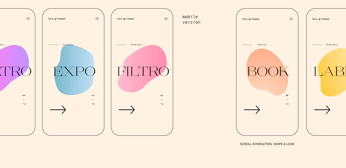
This is more relevant now, the current focus is Mobile friendly design. A few years ago, not many designers worried about creating a seamless mobile experience for their users. In contrast, today, you can’t differentiate between a mobile website or a desktop website because the two are already interrelated in order to provide a consistent user experience.
Things to consider:
Before you decide you’ve read enough and it’s time to take action, make a note to consider the following:
-
Is the color scheme consistent across the site, across all of your pages?
-
Do you use specific keywords to highlight different parts of your design features?
-
Does your mobile website have the same functionality as the desktop version?
#2: Improve Your Website Navigation
“To be a great designer, you need a deeper understanding of how people think and behave.” – Paul Boag, co-founder of Headscape Limited.
There is no limit to your navigation effects. No matter how you improve your website, if the navigation is not fast, direct, and easy to access, it will not perform well. If your navigation doesn’t provide an easy browsing experience, you can rest assured that users will leave your website/app.
The following are examples of modern navigation principles employed by the New York Times website:
At the very top of the page, the user has several button choices – Sections, Search, and the Settings Font icon on the far right. Placing these elements directly in the header section of the page without masking them will create a cleaner user experience. It’s as simple as avoiding putting too many content selections directly on the homepage; instead, designers can mask certain areas with modern styling options.
Here’s what happens when someone clicks on a search term:
The search bar expands in the same header area while obscuring the rest of the page, putting the sole focus on individual searches. Think about how much space the search bar would take up if placed directly at the top of the page.
Small tweaks to navigation can go a long way toward saving valuable design space. In this regard, the concept of less is more makes a lot of sense.Well, what else Example of seamless navigation?
One of the most talked about UX trends in recent years is personalization, the idea of using user data to provide a more personalized experience. This can be achieved in many different ways.
Moderate is a popular content publishing platform whose design is world-class. Some of the things Medium does well are the content suggestions at the end of each article (shown above). These range from related content to snippets from similar parts of the site, all promoting different authors and viewpoints. As a result, content discovery becomes effortless, while users can enjoy a more tailored experience.
Some other examples include platforms like Amazon, which carefully analyze your browsing history and make recommendations for you based on items you view, buy, or add to your wishlist.
#3: Give users more control
-
A site that autoplays a song or video? – No!
-
A site that will have a popup pop up my throat within the first 10 seconds? – No!
-
A site that wants me to sign up for basic functionality? – no thanks!
There are many ways to annoy users, but perhaps one of the most unique is that the website does things on the user’s behalf. Sure, collecting email subscribers to generate leads and conversions is important, but if you make those features very explicit, nothing will be collected.
If you have to “squeak” at your visitors to sign up, like you on social media, or give you their email address, maybe now is a good time to rethink your strategy, because anyone who appreciates what you do things and people who show interest in it anyway, your product will do all of those things naturally!
Today we have full header popups, annoying popups and modals that require you to flip back to close the damn thing! That’s a bit too much, and many people will tell you that they just left these sites because of inconvenience.
Why worry about losing your visitor’s attention when you can potentially gain it? All it takes is to make the user responsible for how they interact with certain parts/elements of the page.
Here are some examples:
-
Video playback: Let users decide if they want to play a video on your page. If it’s a promotion, don’t autoplay as it may cause unnecessary distraction to your visitors.
-
Modal boxes: Use a more refined approach to popups, such as “open with a certain scroll ratio” or slide the form off the side of the page. Full-blown popups that take up the entire screen are annoying, and people often leave your site.
-
Ad Blockers: Another trend these days is to prevent users from viewing the content on your pages because they have AdBlock enabled. Don’t completely scare them off by not showing them content. Instead, use a seamless notification in the header/footer of your page to let them know you’ll appreciate it if they turn it off.
-
Basic Features: Anything that isn’t part of your premium/paid model should be free to use anytime. Getting everyone to sign up to see what you have to offer can turn people off.
#4: Provide good content
User experience is not only about design, but also about content quality. Make sure your users get critical information about your website’s content – whether it’s an online store, service website, blog, or other platform. You want to communicate your brand story and keep users engaged as they scroll through your website.
The main goal is to inform and engage users without overwhelming them with too much information, so make sure you understand your target audience and what language and content style they are best suited to read. Ask yourself the following questions:
-
Is my website content consistent and straightforward?
-
Will it arouse users’ curiosity and encourage them to take action?
-
Is spelling and grammar up to standard?
-
Is the length appropriate for the message you want to convey?
Make sure to draft your content before publishing it to your website, and proofread your content files carefully so that everything meets the highest standards before publishing. Tools like Grammarly can be beneficial during the proofreading process and help perfect everything.
#5: Provide a fully optimized experience
The main goal of your website is to engage users and encourage them to take action – whether that means getting them to make a purchase, sign up for a service/program, read your blog, contact you, or any other action. If you want to stay ahead of the competition, you need to commit to delivering a fully optimized website experience. So, what should this experience include?
First, make sure your pages load up to par. Slow-loading sites often have high bounce rates and low conversion rates because no user is focused on waiting for the loading icon to disappear. Even if your website is designed for the gods, users won’t stick around to browse it.
In addition to page load speed, your website should also be optimized for mobile devices. We all know that the whole world is moving towards mobile browsing (and even mobile shopping), so make sure your website is fully mobile optimized to give users the option to browse, buy and take action from their device.
Also, if you are running an e-commerce website, make sure the customer journey is smooth and intuitive. You don’t want your customers to have issues at any stage of the buying process, as this will prevent them from buying and becoming repeat customers. Every process—from browsing products to checking out—should be simple and enjoyable for customers.
UX design is the perfect combination of intuition, creativity and technical skills. To make sure you’re on the right track, put yourself in the user’s shoes. Every time you browse your website, imagine that you are looking at it from the user’s point of view rather than your own. Once you do this, you will be able to improve your website user experience more effectively.

