


Communication with customers is essential for any business. If you care about audiences who are interested in your products and services, you should have an attractive contact us page on your website. Read on for important tips and examples on how to create a killer “contact us” page and convert visitors into customers.
You may have heard of the Pareto principle or the 80/20 rule. This means that only 20% of the effort can produce the greatest results, while the other 80% of the effort is just a distraction. Therefore, to increase efficiency and achieve better results, you should identify the elements of a given aspect (important 20%) and focus your time and energy on it.
This rule can be fully applied to any website.Some pages on your website are The most critical Attract audiences and increase conversion rates. Identifying and paying attention to these pages should be your top priority. This is not to say that you should ignore other website pages, but that some specific pages require some additional analysis before they can be created.
Today, we want to browse one of the most important pages on your website, the “Contact Us” page, and provide you with the most important tips, best practices, and examples to make it super friendly to visitors.
So let’s get started!
7 best practices for creating a killer contact us page – examples
When we consider Build a great business website In order to keep customers returning, we usually pay attention to homepages, product/service pages, blogs, etc. But how many people will spend time fine-tuning the copywriting and design of the contact us page? For most brands, adding a form with the help of a website builder is usually sufficient, but the contact page is more important than you think. So let’s take a look at some important tips, best practices, and examples of “contact us” pages, they will make a difference!
1. Pay special attention to the design of the contact us page
A well-designed and eye-catching contact page is essential to convert visitors into customers. Are you designing your contact page?Remember, it should (ideally) fit the overall design of the website and meet your requirements Brand, Message and identity. However, it is always best to keep the “Contact” block relatively simple to avoid confusion.
Good example of great design: Eosinophils
2. Make your contact page easy to find!
Even if you have a well-designed contact page, it will become useless if users cannot easily find it on your website. Don’t let your users look for it! Research shows that 87% of users expect to find the link to the contact page in the upper right corner of the website header or footer. The title works best.
Good example: Overall design studio
3. Give users the right to choose
When creating the “Contact Us” page, please show all alternative ways to contact you to meet the needs of each customer. A short form to understand who is contacting you and why it is important, but you should go beyond it. Ideally, you should also display other elements:
-
Your business address – showing your location on Google Maps is also helpful for local businesses.
-
Phone number with area code-if necessary, include all department and contact names. Some companies also display photos of customer service team members to build trust and authority.
-
Email-Display your business email address so that you can contact you for news, sales or other types of inquiries. Don’t forget to enhance security and spam protection.
-
Social media links-Your visitors may want to connect with you on their favorite social network.
-
Working hours-You can also include information that tells you when to open or close.
Brilliant example: Musend
4. Simplify your contact form design
The simplicity of the web form is like in Modern web design, There is always a return. As the number of fields to fill in the contact form increases, the conversion rate decreases.
This is a fact. Make sure to include only the fields that need to exist—no more, no less.
To avoid frustrating visitors, follow these rules of thumb:
-
Don’t ask visitors to enter their email (or other information) twice. They won’t like it.
-
Send an automatic confirmation email to tell your visitors that you have received their letter and respond as soon as possible. You can also attach a copy of the submitted message to the confirmation letter.
-
Only include required fields in the form.
-
Check and display errors when the user writes, not after submission.
-
Use the information provided by the user to personalize the confirmation letter. For example: Hello Robert, we have received your message and will reply you as soon as possible!
-
Don’t overuse verification codes. Simple checkboxes or math problems are much better than unclear letters and numbers.
-
Place form fields vertically instead of side by side. It reduces the number of eye movements that visitors make when filling out forms.
-
Don’t overload the page with irrelevant links and banners to keep the visitor’s focus. According to our user testing experience, every second of distraction prevents users from filling out forms. The last thing you want on the “Contact Us” page is to let users browse the news feed and click on the link to the website page instead of completing the form.
Great example: Personnel indicators
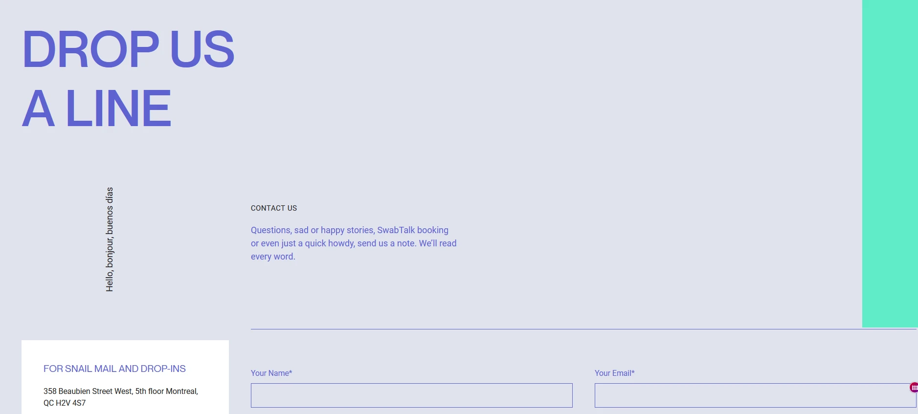
5. Create your contact us page as a landing page for conversion
Create a contact us page Generate leads Should follow to create high Conversion landing pageThe contact page itself is a landing page, so if you need to refresh your memory, here are some tips!
1. Write short and compelling content on your “Contact Us” page. You don’t need to do much. However, be clear and accurate in your copy. For example, tell your visitors why they want to contact you, what problems you can solve for them, what they should expect in return for contacting you, etc.
2. Write an attractive call to action. Go beyond the classic “send us email immediately”, because you may directly collect user emails for some reason. Try to use calls to action that match your brand’s personality. Here are some examples:
3. Make sure you find the right balance between stylish and modern design, Attractive color schemeAnd a visible, clickable CTA button. Just like a landing page, a CTA button to direct users to a unique path is a best practice you can implement.
Great example: Wipe the world
6. Personalize the page as much as possible
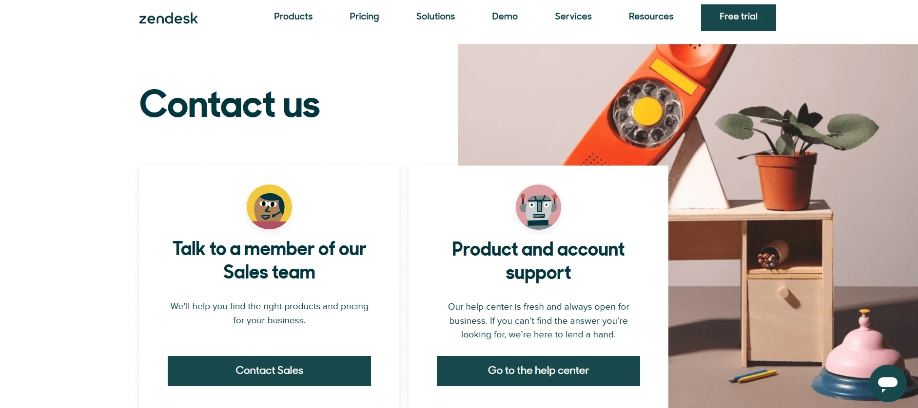
Some people use contact pages and forms to get answers to questions or solutions to problems. So how do you split your contact page into several parts and personalize it specifically for the needs of your users?
Zendesk is a great example of excellent user service and experience. If people choose to contact a real sales representative, or find answers to their questions in the help center, they can contact the real sales representative.In a dominated world Chatbot, FAQ section and extended online guide, occasionally talking with real people is a great way to serve your user base.
Depending on your user role, you can personalize your contact page by combining the help center and customer support with the contact form by interactively providing drop-down menus.
Example of great contact us page: Zendesk
7. Optimize your contact page for better results!
Don’t forget to use Google Analytics or heat maps and visitor logging tools (such as Hotjar) to analyze the experience of visitors trying to contact you.This will enable you to better understand and further optimize your contact page, making contact with you easy and Fascinating user experience.
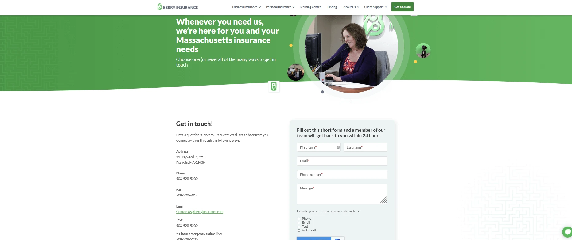
Before we leave your “Contact Us” page, we will analyze the final example of an amazing page that does a lot of good things for users (and business customers):
-
How this page provides users with a clear copy of the service: They can contact the company to learn more about Massachusetts insurance.
-
They show images of real people in real offices, not stock photos or vector diagrams.
-
The company provides users with a variety of contact options-e-mail, phone, chat with real people, contact forms, etc.
-
A brilliant idea is to provide users with a time frame to get a response-24 hours. Telling your visitors when they can provide you with answers can build trust and a perfect user experience. In our digital world, filling out a contact form makes most people feel that their message has not been delivered to anyone and will never receive a response. This insurance company ensures that users meet their communication needs in a professional and timely manner.
-
Looking down the page, you will notice that the company also displays working hours, a 24-hour emergency claim phone number, video call options, etc.
-
Scroll down the page, and if you want to have a special conversation with someone (for example, the company’s vice president or content marketing manager), you can also find a list of key people in the company.
Great example: Berry Insurance
Final thoughts
Creating a contact us page is not easy, especially when you want to build a meaningful and trustworthy relationship with your customer base. However, the more people willing to contact you, the more potential customers and customers you have. We hope that our “Contact Us” page example will help you better understand how to start building this page for your website.
Is there anything we missed? If so, please feel free to share your own thoughts and experiences in the comments!
Are you now ready to build an online presence?


