

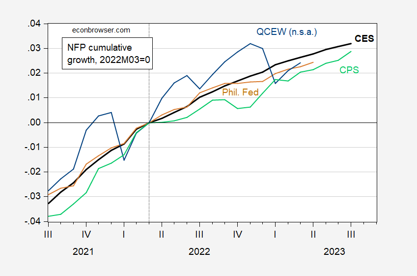
Here is a graph of employment normalized to March 2022.
figure 1: NFP from CES (bold black), adjusted to NFP concept based on CPS (light green), NFP from early Philadelphia Fed benchmark (brown), all SA, and QCEW, NSA (blue ), all of which are recorded in 2023M03=0. Sources: Bureau of Labor Statistics, Philadelphia Fed, and authors’ calculations.
While the cumulative growth rate shown by the QCEW was slightly lower than the official NFP series, it was only slightly down as of March (2.4% official, 2.6% official, 2.3% Philadelphia Fed). Since the graph is logarithmic, a flattening of the curve indicates a slowdown.
Another way to understand the trajectory of employment is to look at year-over-year growth rates (calculated as log differences), which accounts for seasonality.
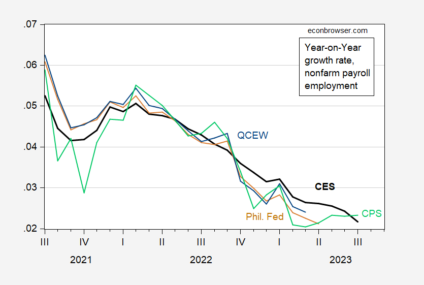
figure 2: Year-over-year nonfarm payrolls growth from CES (bold black), CPS adjusted to the NFP concept (light green), and QCEW (blue). Sources: Bureau of Labor Statistics, Philadelphia Fed, and authors’ calculations.

