

Choosing the right font for your business affects your target audience and their engagement with your brand.
People have distinct feelings, reactions, and associations when they see certain colors. they are also right Fonts and Fonts. Therefore, it is crucial to use these emotional response in your favor.
Typography is the art and technique of arranging typefaces so that written language is clear, readable, and appealing when displayed. Typography can determine the overall effectiveness of your design and message, and it plays a vital role in your design. logo.
One of the essential elements of successful typography is the right typeface. With so many fonts available, it can feel overwhelming.
The best fonts should be memorable, clear, work offline and online across all platforms, and communicate your brand’s personality.
We’ve outlined some of the things you should expect in your Brand strategy Narrow down your options and choose the font that best suits your brand.
1. Serif or sans serif?
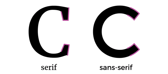
One major way fonts and typefaces are categorized is whether they have “serifs,” the tiny squiggles found at the end of letter strokes.
Serif fonts have these additional bits, while sans serif fonts are, you guessed it, literally. “No [without] Serif. “
Which logo is the best?

serif font with Tradition and stability.
Serif fonts are perfect for high-end brands as they convey elegance, prestige, heritage and authority.

Finance, fashion, journalism and other prestigious industries incorporate this classic style into their designs to great effect.
you will see a lot company logo design In those industries with serif fonts. Burberry, for example, uses a custom-designed serif font that instantly evokes a sense of luxury.

Serifs provide a visual anchor for the character, enhancing its solid and traditional feel, like the TIME logo (using your college professor’s favorite Times New Roman).
They also improve the readability of longer texts, giving the impression of being professional and trustworthy.
When you’re designing content that requires a lot of text to be read, choosing a serif font is a great option to ensure your readers don’t get visually fatigued.
Sans-serif typefaces became popular around the 1800s, around the same time that modernism was on the rise.
As designs move toward a universal style and focus on inclusive thinking, sans serif typefaces deconstruct and modernize traditional typefaces into an accessible and appealing aesthetic.


Popular sans-serif fonts like Helvetica, used by Skype and Target, are all over the web because they fit the modern aesthetic so well. This makes them a great choice for branding and marketing systems, although their ubiquity does make them a less exclusive option.
If you take the time to make sure your favorite fonts reflect your brand personality, you can’t go wrong.
2. Traditional or whimsical?
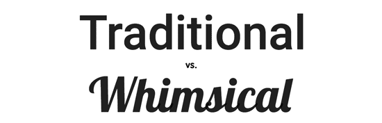
Fonts have personality. Certain typefaces classified as “whimsical” convey playful or even mischievous connotations, while “traditional” typefaces can build a trustworthy or serious brand.

Since fonts vary so widely, it can be overwhelming to figure out which one is right for your brand. Figuring out whether you want a traditional or whimsical vibe is a good place to start. Some fonts look like the handwriting you wish you had: elegant and refined, like Cadillac’s cursive serif (based on English 157).

A traditionally styled font, like Helvetica used by American Airlines, will provide the foundation for your designs in a classic and respectable way.
Going with something traditional will give your brand credibility and a safe, trustworthy organization.


A more whimsical option — think the friendly Disney font, or even the futuristic, hand-tuned version of Futura that Hulu uses — to give your brand a unique vibe. It can be to your advantage to understand that progressive selection will draw attention. Just make sure it matches your brand’s personality!
3. To mix or not to mix?

Mixing two (or more, like LG does!) fonts is a delicate art, but your projects will have a more engaging presence than just one font.
A good rule is to choose a font as your base: your body text is a good choice as this will be the font you will use most often.
Branch by selecting a core element, then choose your contrasting text to build on.

If you want to try multiple fonts but choosing a specific font feels too difficult, try comparing within the same font family. Some fonts include variants within the same font family (such as “Myriad” and “Myriad Bold”).
You can also change the size and boldness of the same font as Linkedin does for its logo.
4. Knows to break the rules
Typography is an effective way to communicate more than just the words involved in a written communication. It shows personality by visually representing the tone and tone of what you’re talking about.
You may find that your goals are best served by using fonts with a strong personality throughout your website or by using a mix of sans-serif and serif fonts.
However, when you decide to take a less traditional path in type design, you have to do it very carefully.
Making sure you are familiar with the conventions and rules that are commonly followed in design will allow you to better break those rules.
Once you understand how typography and design work together, you can subtly move away from standard forms to create striking new designs.
How you use typography has a decisive impact on the perception of your brand and content, which means your font choices can have a real impact on your company.