


Google has created and shared a free template for visualizing your Search Console data as a bubble chart in Google Data Studio.
This makes it easier than ever to analyze Search Console data with bubble charts—a task that people have been using third-party tools for.
Now, creating a bubble chart is as easy as clicking a link to a Google template.
Google designed this chart to help you understand which queries are performing well for your site and which can be improved
Additionally, Google has tips on how to use this template to isolate your most important data.
It’s all shared in the latest installment of Google’s search advocate Daniel Waisberg’s blog series dedicated to Google Data Studio.
Here’s more information about the template and how to use it.
Google Data Studio Bubble Chart Template
To visualize query data with Google’s bubble charts, you must first connect From Search Console to Data Studio.
Next, open the link google template In the browser you’re signed in to the Search Console account you want to manage.
The chart will automatically populate with data and render a page like this:
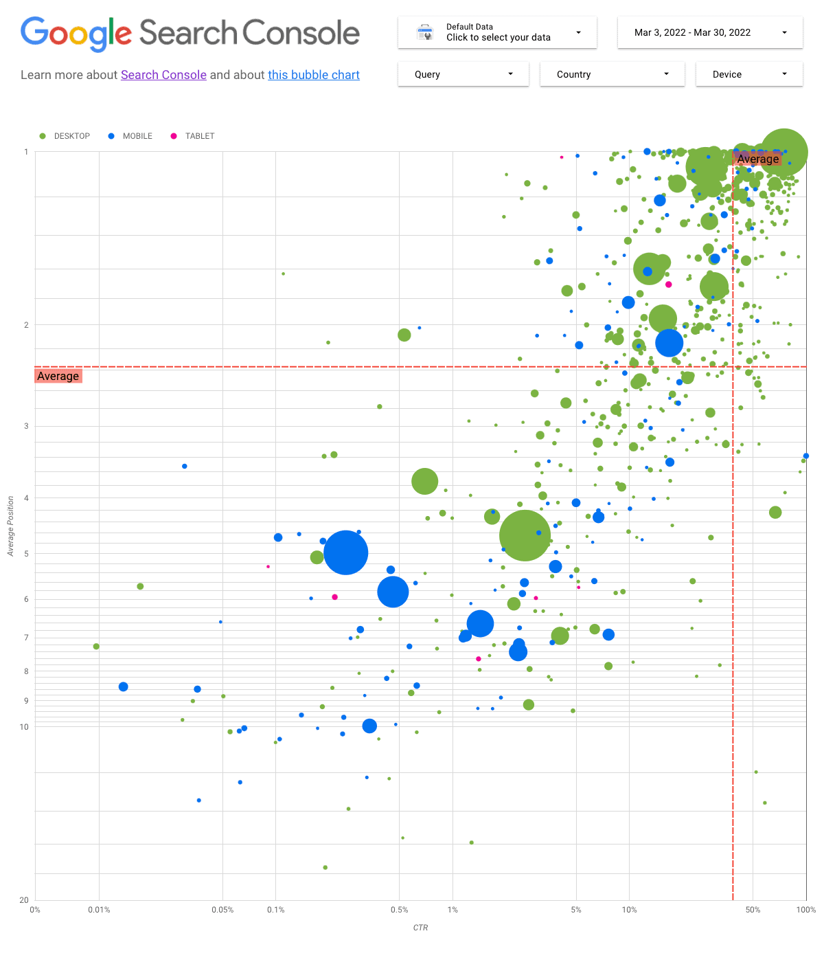
It might sound simple, but it’s all you need to do to create a query data bubble chart in Search Console. Google has done all the hard work of creating the template.
Now let’s discuss the data shown in the chart and explain why you should use it in the first place.
What am I looking at?
Here’s how Google’s bubble chart charts query performance:
- The y-axis represents the average position
- The x-axis represents CTR
- The size of the bubble represents the total number of clicks
- The color of the bubble represents the device category
- The red reference line shows the mean value for each axis
- Each quadrant shows four types of query performance
Each bubble in the graph represents a query, and the data is pulled from the Site Impressions table in Search Console.
You can use regular expressions to include or exclude queries for charts to focus on. Data can be filtered by date, country and device.
Why use a bubble chart?
Bubble charts can be used to find relationships between variables. It displays data as circles on a chart using the X and Y axes.
The main benefit of using a bubble chart is the ability to plot data with multiple dimensions on the same chart.
In Google’s Data Studio Bubble Chart template, you can find a query and see its clickthrough rate (CTR), average position, and number of clicks at the same time.
Data is plotted across three dimensions: desktop, mobile, and tablet.
This makes it possible, for example, to look at a graph and instantly identify queries that rank high on mobile but have low CTRs.
Without a bubble chart, you would have to cross-reference multiple sets of data to find that information, which would take more time.
Most importantly, Google created this chart to help you decide where to invest your time when optimizing query performance.
source: Google
Featured image: Kaspers Greenwalds/Shutterstock


