

If you’re even interested in web design or e-commerce, you’ve probably heard the terms UI and UX. User interface design, or UI for short, is the space in which users interact with elements built by designers. In contrast, UX (User Experience) is a term used to describe the process designers use to create meaningful and enjoyable online experiences for their end users.
Common mistakes you can make in UI/UX design
User experience is crucial as it is designed to create a positive association with your brand. As a business, user experience can have a tangible impact on your bottom line. Have you ever landed on a website that confused you, or had trouble viewing your shopping cart, or that the search bar provided irrelevant results? You might get frustrated and click away.
UX tries to avoid these problems and design the product with the end user in mind, but sometimes designers make some rookie mistakes that lead to an unpleasant experience. Let’s take a look at some common mistakes you can make in UI/UX design.
complex navigation
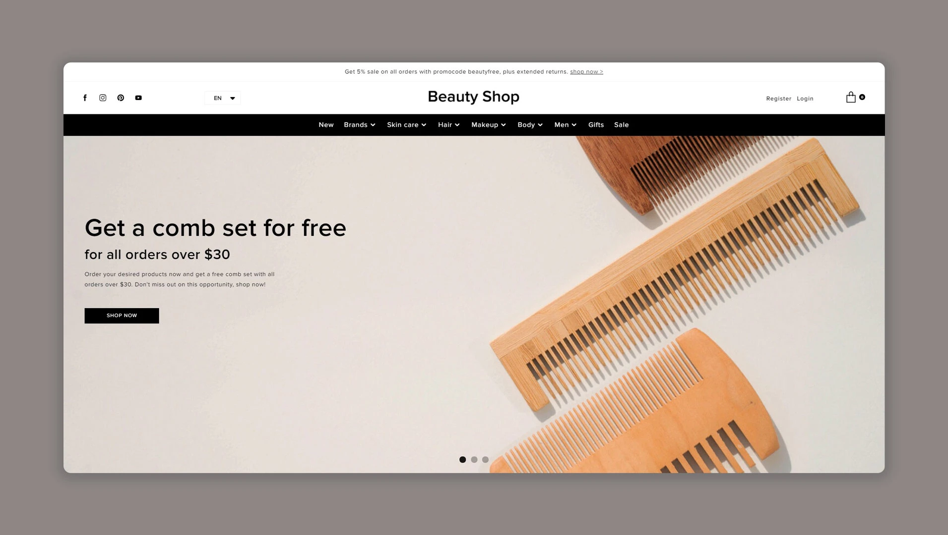
A good user experience is always intuitive and clear. Users should arrive at your website and know where to click to find the information or product they are looking for. A good rule of thumb is that you shouldn’t have more than 3 clicks to any page of your site, so try to keep your navigation as simple as possible.
Avoid aesthetic tricks and gimmicks with navigation tools, and use color or whitespace to separate navigation elements. For example, pinned menus aren’t always the most appealing option, but nothing annoys users more than a menu that collapses before they make the choice they want. Also don’t overfill the title. Keep it as concise and logical as possible, with short text and clear labels. Align your navigation across the site and adapt your solution for mobile and web for the best experience.
Clearly indicate which buttons and links are clickable, and ensure that if you click something by mistake, you can easily navigate back to the previous page.
Poorly designed shopping cart
If you sell online, you know your shopping cart is critical. Checkout should be seamless and fluid, but so should the entire experience of adding products to the cart, removing or adding items to the cart, and returning to the cart later.
Poor product options (add/remove items), opaque shipping options, large, prominent promo code bars, and poor copy increase cart abandonment rates.
Make sure customers can select products and easily navigate back to the shopping page before checkout, and include a mini-cart that shows shoppers how many items have been added to their cart. Include important product information, such as size and color, in the cart product window so shoppers can easily verify that they have added the correct item before checkout. You should also show information that could increase or affect sales, such as how much a customer would have to spend to get free shipping.
Messy/complex layout
When it comes to UX, less is more and you need to keep consistency in mind. Using different fonts, colors, and buttons might make you stand out as a designer, but clients might be confused. Use well-formed, sparse text and a consistent, unified color scheme. This is even more important when you design mobile solutions that are viewed on small screens. You should use minimalist, clean layouts and colors.
You should also apply these principles to the content on your website. Too much clutter can drive users away from what they’re trying to accomplish on your site.
Overuse of fancy fonts
web design comes down to typesetting. Stylish, light-colored fonts look elegant and clean, but they can also cause some problems. They are not very readable and may not render correctly on different display types.
Fonts should be large enough and legible enough to read.
Your font choices should always be functional, readable, and inclusive. Low-contrast text is a good example of a popular design choice that leads to a poor user experience because it’s harder to read.
When it comes to text length, less is more. Try to use clear headings and subheadings and keep paragraphs short. Most users browse titles to find what they are looking for as quickly as possible.
Hard-to-find key details
according to Research An Ipsos survey shows that 49% of shoppers lack trust in online stores. It’s safe to say that if customers don’t trust the look and feel of your website, they won’t rush to hand over their credit card information. If you don’t include contact or customer service information, customers won’t trust your website because they may worry that they won’t have any recourse if something goes wrong.
Keep your contact information and a link to the help desk in the header, sidebar or footer. It’s a good idea to include your phone number, email, and links to social media sites like Facebook or Instagram.
Lengthy or mandatory registration
Forced logins are a thorny topic often debated by marketers and UX professionals. On the one hand, asking someone to sign up before using your website is a great way to convert leads by capturing their contact information. On the other hand, registering anything is a real hassle for most of us.
It’s far more common these days for customers to opt in to checkout with a guest account, as closing a sale is more important than getting their email address. If you mandate registration and login, keep the process as short as possible. Any form that is too complex and too long is likely to cause the client to abandon the site entirely. That being said, stick to the most necessary information to complete your order and gather the permissions you need for marketing and promotions.
It’s also a good idea to ask for that information at checkout rather than up front.
unresponsive website
it is said 94% of people Wouldn’t trust a website that doesn’t have a mobile version. It’s hard to believe, but many websites still don’t have mobile responsive versions.This is a surprising statistic because Google will penalize your site if you don’t mobile friendly.
Remember that your customers will browse your website on multiple devices, from tablets to mobile phones to desktops and laptops, so the UX experience on each device must be as seamless and enjoyable as possible.
Optimize for slow computers and connections, and ensure your designs render correctly on multiple browsers and devices.
Don’t do your UX research
Perhaps the biggest sin a designer commits when it comes to UX is being overconfident. It’s hard to say exactly what makes a good user experience because it varies from person to person. Of course, there are some tried and true best practices to follow, but no one knows for sure. This is why doing your research is an integral part of your UX design process. Prototypes and concepts should be tested With real-world target users and your stakeholders, you should take their feedback to heart.
You should also remember that perfecting your UI/UX design is a continuous process This will happen long after you start it. You will continue to improve and edit as the site learns and grows.
judgment
What does good UI/UX design look like?A good user interface and experience is more than just combining the right color, fonts and graphics to arrange your website in an aesthetic or logical way. Rather, it is about creating a clear path for someone online to complete a task or series of tasks with a specific purpose.
To create a great user experience, you must understand who these users are, their goals, and what they are looking for on your site. In many ways, user experience is also a product of an online store. Your consumers must buy the concept and experience like all other items you sell on your website. Likewise, a good user interface can grab your audience’s attention and up-sell your products and services through simple navigation and design and building trust with your audience. If you can eliminate these common mistakes, your website and sales will take off.

