

What does brand identity mean?
Brand identity is a collection of visual elements that makes your business unique and different from other businesses. Brand identity is what you, customers, and prospective customers can see and is different from brand image and branding, even though those terms are often used interchangeably.

This is the definitive guide to creating a unique and memorable brand identity in 2021.
So, if you’re looking to build a strong brand identity, you’ll love this guide.
Whether you’re starting a new business and writing a business plan or rebranding an existing business, you will get proven, actionable insights and advice on getting a memorable custom logo design and a catchy business name. Plus, you’ll find actionable tips and insights that will help you build a complete visual brand for your business or organization.
The Definitive Brand Identity Guide
Here are the many questions about brand identity we answer in this guide:
- What are the elements of brand identity?
- Why is brand identity important?
- What makes a strong brand identity?
- Examples of strong brand identity (Nike and Apple).
- What is the difference between brand and brand identity?
- What is the difference between brand image and brand identity?
- What is the difference between brand and branding?
- How do you create a brand identity?
- How do you define brand identity?
- How do I find my brand identity?
- How do you design and develop a great brand identity?
- The Dos and Dont’s of building a brand identity.
- What is a brand vs. a logo?
- What is brand equity, and why is it important?
- What are the benefits of a strong brand identity?
- And MUCH more.
Let’s get started.
Chapter 1
What is brand identity?
Brand identity is different from a brand, brand image, and branding. Yet, many people mistakenly use those terms interchangeably.
![]()
Brand identity is the special sauce that sets you apart from your competitors and other businesses. Brand identity consists of various visual elements, including:
- logo or wordmark
- different logo variations
- key brand colors and color palette
- typefaces
- typographic treatments
- a consistent style for images and content
- library of graphical elements
- brand style guide
- your visual identity on social media
Large, successful companies pay careful attention to their brand identity. In fact, many larger companies have corporate communications departments that focus on building brand identity, maintaining it, and evolving the brand identity and brand image to ensure that corporate identity facilitates the corporate business objectives.
Small businesses don’t have corporate communication departments or teams. But, they must still build a strong brand identity for their business.
Powerfully simple strategy for business growth

Our brand identity workbook has actionable insights and steps to help you build a strong brand identity.
We just emailed the brand identity workbook to you.
After all, the goal of brand identity design is to tell your company’s story in a way that creates brand loyalty, brand awareness, and excitement.
In short, brand identity is how you want your customers and prospective customers to perceive your brand or your product or service.
Strong brand identity is important for companies of all sizes, not only large companies like Coca-Cola, Apple, Google, or Facebook.
A successful brand identity is one of the company’s most valuable assets. In fact, the overall value of companies like Apple, Coca-Cola, Nike, and others is reflected in the high value of their brand.
Ramon Ray, one of the country’s top small business experts, explains:
People immediately recognize a Starbucks logo or a BMW logo because those logos are consistently displayed and used by each Brand. Smaller businesses might think that they don’t need to be consistent with their identity, but they are mistaken. People recognize businesses based on their brand identity.
Only small businesses that have a small mindset don’t worry about design and branding. Small business owners who think big, who think about growth, who think for scale – those owners understand that branding is important and invest in their brands.
Brand identity design takes disparate visual elements and unifies them into a complementary identity system. All brand identity elements should be consistent in their appearance, use, scope, color palette, feel, etc.
Brand identity and the halo effect
A strong brand identity gives companies a competitive advantage.
For example, customers often favor a product line because they’ve had a positive experience with other products from that company.
This is called the “halo effect.” The halo effect is correlated to brand strength, brand loyalty and contributes to brand equity (more on that below).
When people prefer your company’s products or services because you’ve created a strong brand identity, you also raise your brand image and increase brand awareness.
The halo effect helps you build a brand and increases your mindshare (a marketing term that describes the amount of brand awareness or popularity surrounding a product, service, or company).
Remember that whether you actively create a strong brand identity or ignore it, you will still be presenting an image to customers and prospects.
Brand identity and the horn effect
In fact, the halo effect’s opposite is the horn effect (named for the devil’s horns). When people have an unfavorable experience, they correlate that negative experience with everything associated with that brand.
For example, this often happens when an otherwise powerful brand does a poor job on social media, managing customer expectations, and complaints. Brand loyalty suffers.
If you want to build a brand and have a strong brand identity and brand image, be proactive and deliberate in helping shape how customers and prospective customers perceive your brand and your products and services. Brand management is important. If you leave your brand identity to chance, you lose the ability to shape the conversation about your brand.
What is a brand?
A brand is the total of your customers’ and customer prospects’ experience with your business. Originally, the term ‘brand’ referred to the mark that cattle ranchers put (‘branded’) on their cattle. But the concept of ‘brand’ has evolved to include much more than a single visual element.
Your logo is not your brand
Some people use the word “brand” to talk about logos. For example, you’ll often find people asking about creating a brand or how to build a brand.
But, a logo is not a brand. A logo is a visual symbol for a business and part of its brand identity, but it doesn’t represent its entire brand identity. A logo doesn’t build a brand – it’s one step towards building a complete brand identity.
Put another way: a designer’s job isn’t to create a brand. Designers design and create the brand identity.
Brand development is the process of building a brand. More specifically, building a strong brand.
A strong brand communicates what your company does and how it does it. A strong brand also establishes trust and credibility with your prospects and customers.
Your company’s brand is a promise you make to customers and prospects about your product or service and your company.
Your brand lives in everyday interactions your company has with its prospects and customers, including the images you share, the messages you post on your website, the content of your marketing materials, your presentations and booths at conferences, and your posts on social networks.
Importantly, your brand image is not what you say it is.
Your brand image is how your customers and prospects perceive your company.
You may want your customers and prospects to see your brand as innovative, fresh, and socially conscious.
But what’s most important isn’t what you want – but how they actually see your brand. As Jeff Bezos famously said,
Your brand is what other people say about you when you’re not in the room.
Brand identity and branding are not the same
What is branding?
Branding is a process designed to develop, among other things, a brand name and custom logo design for a company, product, or service.
But branding isn’t only about tangible concepts like a company’s name and logo. It’s also about the company’s reputation, how a company’s products and services are advertised, and about a company’s values.
The branding process aims to build brand awareness and brand loyalty and create a strong brand image.
Branding is not only for companies and organizations.
Personal brands (how an individual builds their personal reputation) have become popular. And, influencers have gained power and a strong following, especially on social media. Naturally, you’re seeing many of them invest their energy, money, and time to build a strong brand identity for their personal brands.
Even countries have embraced branding and have sought to create a compelling brand identity to attract tourists and immigrants. Some have spent millions of dollars developing a contemporary and unique brand identity.
There are other important branding terms you should understand.
- Brand assets – visual design assets (fonts, colors and color palette, resources, etc., form the outward-facing brand).
- Brand associations – anything that people associate with a brand.
- Brand awareness – the ability of customers to identify a brand in a crowded market.
- Brand personality – the brand’s personality traits (e.g., innovative, socially conscious, trustworthy, friendly).
- Brand positioning – how a brand is perceived against its competitors.
- Brand promise – a brand’s unique selling proposition (for Volvo, it’s “safety”).
- Brand values – what guides your company’s decisions and behaviors?
- Brand voice – how does your brand “speak?
Strong brand identity design example – Nike
The Nike “Swoosh” is one of the most recognized logos in the world.
![]()
![]()
The famous Nike “Swoosh” was designed by Carolyn Davidson in 1971 and has become a core symbol of Nike’s brand identity.
Only a student at the time, Davidson, earned $35 for the design. But, Nike founder Phil Knight never forgot her contribution. Davidson continued to work with Nike and was awarded shares of the company when it went public in 1983.
Davidson’s famous design was inspired by the brand’s namesake Nike (Greek goddess of victory). Nike was known for her wings, which allowed her to fly over battlefields safely. Davidson visually combined a check-mark with a wing to create a unique abstract shape that communicates speed and agility.
To this day, the Nike “Swoosh” is considered an ideal example of an abstract logo that manages to communicate brand identity perfectly. Logo designers worldwide seek to create the next signature abstract logo design to achieve Swoosh’s success.
But while the Swoosh is important, it doesn’t reflect Nike’s complete brand identity.
The Nike brand name stands for something much bigger today. Nike created a brand identity we see today through deliberate brand management by redefining itself from a simple shoe company to an athletic and fitness lifestyle brand.
Nike accomplished this by hiring celebrity endorsers like Michael Jordan. Nike also downplayed the competition and created an exclusive feel about its products. Today, most consumers think about Nike’s products as high-end products. And those who can afford Nike products show them off as status symbols.
Nike is one of the best represented, culturally understood, and symbolic companies on Earth (other examples include Adidas, Coca-Cola, Amazon, Google, Twitter, and Facebook). It has a strong global brand image. Those accomplishments reflect the many things Nike has done since starting the company.
Strong brand identity design example – Apple
When you hear the brand name Apple, you probably picture its well-known and iconic logo.
![]()
![]()
Apple is one of the world’s most successful and most valuable brands. It consistently appears in surveys of the most effective and valuable brands in the world.
Apple’s brand identity starts with its business name and logo but extends far beyond the name and logo.
The logo is iconic but very simple. While it’s changed over the years, it’s instantly recognizable around the world. It helped Apple build its brand and brand image and has played a key role in creating Apple’s compelling brand identity.
You probably also think about the iPod, the iPhone, the Apple Watch, and the many other products Apple has sold over the years.
And some of you will think about Apple’s “Think Different” campaign. That was an award-winning campaign that positioned Apple as a premium, unusual company.
Apple’s brand strategy has always focused on emotion.
For example, Apple has historically created an aura of secrecy surrounding its inner workings. They don’t preview future product releases and keep new products under tight wraps. As a result, Apple generates a lot of buzz and conversations in the market about future products.
By maintaining an aura of secrecy, Apple created an unrivaled hype when they actually release products.
What people say about Apple’s products fuels the hype. But Apple doesn’t leave that to chance.
By focusing on premium exclusivity and pricing when releasing products and paying careful attention to aesthetics and usability, Apple has grown to be associated with luxury in the eyes of its customers and prospective customers.
As a result, Apple can charge premium prices and confer a symbol of status on its customers.
Because of careful brand management, Apple has extreme brand loyalty.
All these factors extend far beyond the name Apple and the company’s logo. Apple’s success and brand image are driven by its complete brand identity, not one isolated element of its identity.
Strong brand identity design example – Coca-Cola

Coca-Cola is one of the top 3 food and beverage companies in the world.
In fact, the brand is so ubiquitous that soda of any kind can be called a “coke” in many regions of the southern United States.
Coca-Cola owes much of its success to the consistency of its brand identity. And, importantly, its log has remained largely unchanged since the 1900s. The script font and classic red color are recognized worldwide, even when the name is displayed in another language.
Coca-Cola’s logo and brand identity has barely changed since the company was founded in 1892. And the company has leveraged the red color in its logo and the scripted font to extend it to other design assets, like the classic ribbon-like imagery features on its cans.
Its scripted typeface is fun, and Coca-Cola sometimes pairs that typeface with unique glass bottles that have become iconic. The bottles and the name reinsure customers that they’re the real thing, not an imitation cola.
Here’s your key takeaway from Coca-Cola
Give your customers the time and opportunity to get to know your brand by using a consistent and recognizable brand identity. Brand management helps you to build a stronger brand.
Brand recognition – at its core – depends upon consistency. Repeated exposure to your brand identity creates familiarity and trust and helps you build a brand.
In other words, plan for the long game.
Widespread brand recognition doesn’t usually happen overnight.
So, make branding choices that will stand the test of time and then stick with them.
What is brand equity?
Brand equity is the brand’s value (determined by consumer perceptions of a brand). A healthy part of the most renowned companies’ market value (Apple, Amazon, etc.) is tied to their brand equity.
Chapter 2
Creating Your Brand Strategy
As discussed above, your company brand is defined by how people perceive your company, not by what you say the brand is.
Every decision your company makes, and every action that it takes affects the brand.
![]()
Poor design, a weak brand identity, ineffective marketing, inconsistent messaging, and bad partnerships can tarnish a brand.
Instead of leaving your brand’s public perception to chance, it’s always a good practice to build and shape your brand.
Doing so doesn’t guarantee that the public will perceive your brand exactly as you intend. But it will help shape public perception.
Your brand identity is the face of your business. It builds credibility and trust with your customers and prospective customers. And it provides the foundation for your advertising and marketing. It reinforces your company’s mission and values, and it helps you find new customers and delight existing customers.
Brand strategy can help you do all of these things.
What is brand strategy?
Brand strategy is how your company will build, shape, and share your brand with the public.
Why do you need a brand strategy?
Every company has a brand and brand identity.
The only question is whether you’ll leave your brand and brand identity to chance or build a visual identity by taking deliberate steps to help shape the public’s perception of your brand and brand identity.
No successful company has ever left its brand image, brand identity, and branding to chance. The most successful companies take brand management seriously.
Instead, smart companies are intentional and public about their mission and values, among other things. Put another way: smart companies create a brand identity and brand image, rather than take the chance that strong brand identity and brand image will simply form independently.
There’s a good reason for this. 87% of consumers will buy a product solely because of brand values.
Building a brand requires companies to make intentional, smart choices about their visual identity and brand story.
Brand strategy can help you. Brand strategy is your plan for how you’ll help shape the public perception of your brand.
Here, the “public” includes your customers, prospects, your employees, vendors, and others who connect in any way with your brand, whether in person, via email, on social media, or offline.
If you’re happy with your business and the money it’s making, you can stop reading. But if you want to speed up growth and improve your revenues and profits, you need to up your game. Ramon Ray says that:
If you’re happy with your business, happy with your income, no problem – you don’t need to do anything. But if you’re worried about the competition, you need to think about improving your branding and your brand identity. If you want to step it up, raise your prices, if you want to increase your profits, if you want to get people excited about you and your business … up your game and invest in good design. A good brand strategy can help you take your business to the next level.
How do you build an effective brand strategy?
There are three phases to develop an effective brand strategy for most companies: discovery, identity, and execution.
Phase 1: Discovery
If you’re launching a new business and don’t yet have a visual identity, discovery is easy.
Your company is not known to anyone, and there’s nothing to discover. You can proceed to create your brand identity and can move to Phase 2.
But if you have an established business, be sure that you don’t skip this step. Market research is important.
Before you can define your modified or new brand identity, you must understand your existing brand identity and objectively look at all factors that influence how your company presents itself publicly.
This includes evaluating your customers, industry, vision, mission, values, brand identity, brand image, and brand.
1. Start by evaluating your existing core brand identity
Your core brand identity is often defined by your company’s vision (why your company exists), mission (what your company does), and values (the beliefs that guide your company’s actions).
You may already have your vision, mission, and values documented, but don’t worry if you don’t.
Some companies chose to document these and put them on an office wall or their website. Others are less formal but take the time to understand their vision, mission, and values.
The important exercise for existing companies is to evaluate whether their original vision, mission, and values are still relevant. Here are some helpful questions you can ask:
- Are there elements that have emerged in the company’s culture reflected in that vision, mission, and values?
- Are some of the existing elements poorly defined or no longer valid?
- What’s most important to your company?
- Do your existing brand identity and marketing properly communicate your core identity?
2. Conduct market research and perform a competitor analysis
Once you understand your core brand identity, the next step involves market research and competitor analysis. Here are some useful questions to ask when you conduct market research:
- How big is your market?
- How has your market changed since the time you started your company?
If you’re looking for help to understand your market better, watch this video on how to define a market’s size.
It’s not enough to understand your market to develop a strong brand identity. You also must evaluate your competitors to understand where your company is positioned in your industry. Among other things, look at the brand identity each competitor has created for its business.
There are three parts to a good competitive analysis: (1) defining the metrics and identifying the competitors you’re comparing, (2) gathering the data, and (3) the analysis. We explain these in detail in 10 Tips for Evaluating Your Competitors.
3. Develop personas for your target customers
Personas help you figure out:
- Who your customers are,
- What their goals and frustrations are,
- Where they spend their time,
- When they’re the most active or available,
- Why they make certain decisions, and
- How they interact with your product line or buy your services.
4. Evaluate how people perceive your brand and your brand identity
As we wrote in Brand Health, 6 Important Questions You Should Ask About Your Small Business Brand,
Brand health can be measured in numerous ways, including brand reputation, brand awareness, brand equity, brand positioning, and brand delivery.
This isn’t an issue you can afford to ignore. You need to know if your brand is thriving or ailing – before it’s too late.
Remember that you should evaluate both internal (your employees) and external (everyone else) perceptions of your brand image.
Do people react positively, neutrally, or negatively when they hear your brand name?
The insights from these evaluations will help you understand your brand image’s current perceptions and the things you may need to change to improve those perceptions and your overall brand image.
Phase 2: Brand Identity
1. Define your core brand identity
Once you understand how your brand is currently perceived and its position in your market, you can begin to define your company’s new brand identity.
To remind you, your core brand identity is often defined by your company’s vision (why your company exists), mission (what your company does), and values (the beliefs that guide your company’s actions).
If you’re starting a new company, you start with a blank sheet of paper and have the opportunity to define each of these.
If you have an existing company, you evaluated your core brand identity in the discovery phase. You now have a chance to evolve that identity to better match your current/future vision, mission, and values.
2. Articulate your brand positioning
Your brand positioning explains how your company is different from your competitors.
Your positioning can often be summarized in one or two sentences to explain what you do better than everyone else.
3. Articulate your unique selling proposition
As we wrote about a company’s unique selling proposition:
Ultimately, a USP is what your business stands for.
For example, you could say that Apple’s USP is found in “user experience”: everything they do is meant to have the user at its core.
Google’s USP might be in the way they connect people with information, whereas Amazon’s might be providing whatever product you need quickly, efficiently, and at as low a cost as possible.
Figuring out what your USP is can take time, but it’s a crucial piece of your brand. Knowing what it is can help you sell better to your existing customers, and more importantly possible customers.
4. Develop your brand identity design assets
When you understand your brand and the components that define brand identity (colors, typography, shapes, etc.), it’s time for you to work with your graphic designer to develop the creative elements that will help you build a brand and give life to your brand identity. These include your logo, web design, product packaging, brochures, and more.
5. Develop your brand voice and how you communicate
To build a strong brand, brand identity, and brand image, you must consistently and uniformly talk about your brand, both internally and externally.
Pick a consistent brand voice and ensure that your communications are clear, focused, and support your positioning.
Make sure that your brand identity is clearly and consistently reflected in your digital marketing and traditional marketing.
Your content marketing stories, offline and digital marketing, and even your product packaging design should consistently showcase your brand identity.
Phase 3: Execution
Once you’ve completed the discovery and developed your core brand identity, you must find the right way to communicate your brand identity and brand through marketing (digital marketing and traditional marketing).
Chapter 3
Brand Identity Research
Before you dive into designing the elements of your brand identity and building your brand, you must understand how your brand is currently perceived, your customers, and your competitors.
![]()
If you’re building a new brand, you can skip this first part below (understanding your brand).
But if you have an existing brand, this is a critical first step in building a more effective brand identity for your business or organization.
Understanding your brand
If your brand isn’t healthy, neither is your business.
That’s because your brand’s health impacts both the brand awareness of your business and your bottom line.
A strong brand is not a luxury to be enjoyed only by companies like Nike or Coca-Cola. It is a key factor in the success and prosperity of all businesses and nonprofits, regardless of their revenues. Your brand health is guaranteed to have a significant impact on the consumer awareness of your brand AND your bottom line. It directly affects your ability to sell, to fundraise, to hire the best employees, and to grow. A healthy brand is the hallmark of a company or nonprofit that is prepared to prosper.
SWOT analysis
You have to develop a higher-level understanding of your business and the context in which it operates.
That’s where a SWOT analysis can help.
By examining your business’s strengths, weaknesses, opportunities, and threats, you may find a path to new growth.
What is a SWOT analysis?
A SWOT analysis is a strategic planning framework used to take a big-picture look at the internal and external factors impacting your brand and business.
“SWOT” stands for Strengths, Weaknesses, Opportunities, and Threats.
The first half of SWOT (strengths and weaknesses) addresses the internal factors within your business or brand working for and against you.
Opportunities and threats (the second half of SWOT) are, of course, the positive and negative external factors your brand must navigate through.
This kind of holistic, high-level thinking is valuable and necessary to ensure that you don’t get lost chasing after details that don’t deliver the return on investment your business needs to survive. This makes SWOT analysis a vitally useful tool.
To learn more, read this actionable guide on how to conduct a SWOT analysis.
Questions that can help you conduct a SWOT analysis:
Strengths
- Does your business have a unique backstory or mission?
- In what areas does your business regularly excel? (customer support, digital marketing, offline and traditional marketing, sales, fulfillment, etc.)
- What strengths or unique skills do your employees possess?
- Is your business well-funded, or does it own other useful resources it can rely on?
- Does your business have a proprietary product line or service that can’t be obtained elsewhere?
- In what respects is your brand well-perceived?
- Does your business have a unique value proposition?
- In what ways is your brand aligned with your current mission and business direction?
- What aspects of your brand are authentic?
- Which elements of your brand image resonate with your target audience?
- What parts of your brand identity are communicated well?
Weaknesses
- In what areas does your business regularly perform poorly?
- Does your workforce suffer any consistent weaknesses? (poor morale, lack of training, etc.)
- Does your business lack resources such as time, staff, or funds?
- Are your business goals unfocused?
- Do you lack strategies for moving forward?
- Are there elements of your brand image that are inauthentic?
- Is your business failing to follow through on any brand promises?
- What parts of your brand identity are poorly communicated?
- Are any brand messages failing to resonate with your target audience?
- What aspects of your brand are perceived poorly?
Opportunities
- Can you fill a niche that is currently empty or under-represented?
- Could you partner with another business to gain exposure, financial support, or consumer goodwill?
- Can your product or service outperform a competitor’s?
- Will changes in state or federal legislation help your business in any way?
- Are improving economic trends likely to impact your business?
- Can your brand authentically align itself with any popular causes?
- Can you change your value proposition to gain market share?
- Do any current trends benefit your business or brand image?
- Are there any new technological advances that could improve your product?
- Can you modify an existing product or service for a new demographic?
- Is there an existing unsung aspect of your brand image that you could highlight?
Threats
- What are your competitors offering that you can’t compete with?
- Are your competitors doing especially well engaging the target audience on social media?
- Are downward economic trends likely to impact your business?
- Will changes in state or federal legislation hinder your business in any way?
- Are any of your vendors or suppliers unreliable, increasing their prices, or going out of business?
- Are there any cultural shifts that may harm your business or brand image?
- Will weather changes negatively impact your business? (loss of crops or materials, or shipping delays)
- Are there any current events that may cast any elements of your brand in a negative light?
- Is your brand aligned with any negative entities, organizations, or ideologies?
- Are any competitors attempting to discredit your brand?
That’s a lot of information to process. To save you some time if you’re in a hurry, look at the bigger picture and ask these 3 important questions to understand your brand better.
1. Does your brand support your business strategy?
Every healthy business should have a forward-looking strategy.
For your brand to be healthy, it must align with and support that strategy.
Strategy can include brand identity but focuses on the core strategy for growing your business.
If your strategy is to sell expensive services at discounted rates, your brand should focus on price. It would not be in your best interest to cultivate a brand that appears affluent or expensive.
If your business strategy is grounded in creativity and custom work, a brand emphasizing traditional corporate culture will not work well.
A misaligned brand will create cognitive dissonance for your customers, create a confusing brand image and brand identity, and undermine your efforts to succeed.
A brand image or brand identity that undermines your business strategy does not reflect a healthy brand.
2. Is your brand identity consistent?
An inconsistent brand identity is confusing and unreliable. These are traits that drive customers away, not attract them.
If your brand identity constantly changes, it’s hard for customers or clients to wrap their minds around what it’s about. And it’s even harder to gain trust, confidence, and brand loyalty.
Here are some additional questions to help you evaluate your brand identity for consistency…
Is your brand identity design visually consistent?
Visual consistency helps build recognition of your brand.
The colors, visual styles, and fonts on your website should look like your business cards, which should look like your social media accounts, which should look like your business logo, which should look like you.
A visually consistent brand identity is more memorable than an inconsistent identity.
Is your brand messaging consistent?
To build a strong brand identity, your brand needs cohesive messaging. And that messaging should come from your business’s core values and strategies.
If your brand tries to be too many things at once, the messages become scattered, and the brand identity is diluted.
It’s hard to be known for something when you fail to present consistent messaging about what your business should be known for.
Or worse, if your brand messaging contradicts itself, you will lose consumer trust and their business.
People don’t like to be lied to. And, consumers are naturally suspicious of businesses as a general rule. After all, businesses want their money.
Contradicting messages serve as proof that your business is not to be trusted.
Inconsistent messaging is a sign of an unhealthy brand and a weak brand identity.
Does your brand behave consistently?

Image courtesy of Chipotle.
Your brand promises must be consistent with the reality of your customers’ brand experience.
This is true for every brand, regardless of whether you are a tech company or sell burritos.
If you feature speedy delivery as a central brand message but fail to make good on that promise, people will notice. And your brand and brand identity will suffer.
As we explained:
A fabulous logo, expertly deployed and a consistent style guide mean nothing if your business does not follow through on its brand promises in the real world. Remember that your brand should always be true to the reality of your business. Walking the walk is just as important, if not more so, than talking the talk.
Mexican fast-food giant Chipotle has made serving non-GMO foods a key element of their brand promise. But, they’ve repeatedly been spotted serving GMO foods.
Execute a quick Google search for “chipotle admits to using GMOs,” and you’ll find a list of critical articles and lawsuits levied against the fast-food mega-chain. They’ve hit on a compelling branding position, but they’re failing to deliver it reliably. Their brand image has suffered.
Failure to deliver on a brand promise is a sign of an unhealthy brand.
3. Does your brand identity resonate with your target audience?
No matter how well your brand identity supports your business strategies or how consistent it is, if it fails to connect with your audience, your brand identity is not doing its job.
But, measuring your brand’s public reception is a bit trickier than examining it for consistency or internal strategy alignment. You’re going to need some brand health metrics to track.
Marketing intelligence experts at Datorama recommend tracking your branded impressions, internet search volume, and the performance of branded keywords (the use of your brand name on business cards, in messages, posts, etc.).
You may also want to consider measuring social media engagement and keeping an eye on your online reviews. Your customer service team may also be able to offer some useful insight.
Understanding your customers
The first step to building a strong brand identity is understanding your customers and what they want and need. We recommend you ask the following questions about your customers:
- Who are they? – Are your customers male, female, or both? Are they Boomers or Millennials? Where are they from?
- What do they do? Knowing what your customers do for a living and what they’re interested in is a great way to target your marketing more precisely, especially when engaged in digital marketing.
- Why are they buying? – Do you know the reason why they’re in your market? If you do, it’s easier to pair their needs with what you can give them.
- When are they buying? – Find out when your target market typically makes this type of purchase. That way, you can increase your chances of getting their attention they want to give to you.
- What’s the purchasing medium? – Are they buying from a website? Do they prefer a brick-and-mortar establishment?
- What’s their budget? – Make sure you’re targeting customers whose budgets appropriately align with your product or service.
- What makes them feel good? – Knowing what gives a customer that precious good-feeling glow is key to making sure they become repeat customers.
- What do they expect? – Understanding expectations is critical to meet those expectations. Whether your customers expect fast delivery or 24/7 customer support, knowing what they want from you is half the battle.
- How do they feel about your company? – Do your prospects recognize your brand name and your overall brand identity? Hearing praise about your company is nice – it suggests you’ve built a strong brand image. Hearing where the pain points are is even better. You have to know where your business could use a little improvement to, well, improve!
- How do they feel about your competition? – You know what they say. Keep your friends close – keep your competition closer.
Here are 6 important, specific questions you can ask your customers. We’ll discuss each below.
- How likely would you be to recommend our service/company to others?
- How would you rate your last experience with us?
- If you could change just one thing about our products/services, what would it be?
- What other option did you consider before you chose us?
- What makes us stand out from the competition?
- Anything else you’d like us to know?
How likely would you be to recommend our service/company to others?
This is also known as the Net Promoter Score (NPS) question.
If you want a deep insight into your business and brand image’s customer opinion, this is the question you need to ask.
The best way to gauge how satisfied a person is with your business is by learning whether they’d be comfortable telling their mom/brother/best friend/barista to use it.
- Ask: “Taking only your most recent purchase experience into consideration, would you feel good about recommending us to a friend?”
- Ask: “Now think about your entire experience with us. Would you recommend us to your friends?”
How would you rate your latest experience with us?
A negative customer service experience has a huge reach and travels to more than twice as many people as does praise for a positive service encounter.
Head this off at the pass: once a customer buys something, send them a short email asking them about their experience.
This will save you scrambling in the aftermath of any potential PR disasters and will help you:
- Discover how your customer feels about their experience with your business and/or product,
- Provide a solution or make amends to an unhappy or dissatisfied customer, and
- Give your customers an outlet where they are free to tell you everything on their mind – so they don’t have to turn to social media instead.
We do this after every interaction between crowdspring’s customers and our customer support team. We want to know whether we helped each customer and any feedback they might have for us. We also do this after every project on crowdspring.
And we’re very proud of our performance in this area – and have even won awards for our customer support. We have a customer satisfaction rating between 97 and 99%.
If you could change just one thing about our products/services, what would it be?
Every product and service has room to improve, features to explore, and refinements to add.
You probably have your own roadmap for where you want your product to go, and that’s great.
But it’s a good idea to involve your customers in this process, too. They are an invaluable source of ideas, feedback, and feature requests and often see ways of using your product that you hadn’t imagined.
That doesn’t mean you should put in place every feature requested by customers and prospects.
It means you should ask, listen, and assess.
Some of the best features and products originate from customer feedback. The challenge is to be receptive to customer requests for improvements while engaging with them in a meaningful way.
For example, crowdspring offers core design and naming services in many areas. This includes logo design, web design, print design, product design, packaging design, and business names.
When we started 10 years ago, we asked only a few questions to help a customer draft a creative brief if they were looking for design help. For example, in logo design projects, we originally asked some general questions.
But the answers didn’t provide much direction to designers, and we received lots of feedback about our questionnaire.
This feedback was precious. We changed our questionnaire to be more specific and informative, and this improved the experience for everyone.
It was a win-win-win.
There are several services aimed at helping businesses solicit feedback and ideas from their customers. Companies like UserVoice, Feature Upvote, ProdPad, and Wantoo are just a sampling of the available services.
Whatever service or method you use, make sure you’re not only listening but responding, too.
No one likes feeling like they’re yelling into the void, and your customers are no different. Make your feedback process a conversation so that your customers know that their input is valued.
Customers will often take the time to give you input on ways to improve if you ask, but if the exchange feels one-sided to them, they may give up.
What other options did you consider before you chose us?
After completing market research and investigation, you may think you know who your competitors are.
But there’s always the possibility you’ve either missed one or passed on one because their offering didn’t seem comparable to yours.
Asking your customers what companies and services they evaluated is a great way to make those unknowns known.

What makes us stand out from the competition?
Asking this question allows your customers to tell you what they think makes you special.
This is more than asking a question about brand identity design and your visual design. This goes to the unique reasons a customer might prefer your company’s products or services to your competitors.
The answer tells you about your unique selling proposition (USP).
Uncovering your USP can be difficult.
Your USP may not be something physical or tangible like a product, but instead, be more thematic or emotional.
Entrepreneur outlined this in their look at USP:
Pinpointing your USP requires some hard soul-searching and creativity. One way to start is to analyze how other companies use their USPs to their advantage. This requires careful analysis of other companies’ ads and marketing messages. If you analyze what they say they sell, not just their product or service characteristics, you can learn a great deal about how companies distinguish themselves from competitors.
For example, Charles Revson, founder of Revlon, always used to say he sold hope, not makeup. Some airlines sell friendly service, while others sell on-time service. Neiman Marcus sells luxury, while Wal-Mart sells bargains.
Ultimately, a USP is what your business stands for.
For example, you could say that Apple’s USP is found in “user experience.” The value proposition of everything Apple does is meant to have the user at its core.
Google’s USP might be in the way they connect people with information.
Amazon’s USP might be providing whatever product you need efficiently and at as low a cost as possible.
Figuring out your USP can take time, but it’s a crucial piece of your brand and value proposition. Knowing what it is can help you sell better to your existing and prospective customers.
That’s because when customers hear your brand name, see your logo, view your business card, or see other elements of your brand identity; they’ll subconsciously connect your USP to your brand.
And be careful not to adopt the USP of a competitor. Don’t try to imitate others – build a unique identity and value proposition based on your customers’ feedback. Ramon Ray explains:
Don’t try to be someone else. it’s tempting to look at another person or business and imitate them. This isn’t a good strategy. Instead, listen to your customers. What do they say they like about your business? What would they change? But don’t just listen to what your customer says … be sure your team communicates and meets your customers’ expectations through your brand identity and overall design so that your clients and prospects know you’re listening to them.
Anything else you’d like us to know?
It’s always good to leave the floor open to unexpected responses or feedback. You can’t ask every single question, nor can you know in advance what might be top of mind for your customers.
Asking this question gives your customers the chance to mention anything they feel is important. It also gives you insight into what’s important to them.
And, it gives your customer the last word and makes it clear that you’re not just interested in your own questions.
Ways to gather customer responses
There are many different ways to gather answers to these questions.
Which one you choose depends on your goals, who your customers are, and how you can reach them, but here are some ideas to consider.
- Customer feedback surveys. Surveys are tried and tested, but they can be challenging to run in ways that won’t annoy your customers. Companies like SurveyMonkey or TypeForm make running surveys easy. Make sure you keep surveys as short and easy to respond to as possible, and don’t forget to embed elements of your brand identity (color palette, logo, etc.) in those surveys. Also, keep this important fact in mind: every question on a survey will reduce the number of people who respond to the survey.
- Email and customer feedback forms. Having a form on your site or feedback box at your store gives your customers a recognizable way to get their feedback. These tend to work best as either wide open (“How can we improve?”) or more targeted with one or two brief questions.
- Direct contact. Forms and surveys may be easy to use, but they are poor at gathering the greater context or circumstances that your customers find themselves in. One of the best ways to get useful feedback is to reach out directly to customers and talk to them. Bonus points if it’s in person, but if that’s impossible for you, even a phone call or a video chat can be a great way to form that connection.
- Usability tests. Not sure if something is working the way you hoped? Is your shopping cart on your site hindering or helping customers complete their orders? You can use services to test these things and more (including testing elements of your brand identity). UserTesting.com is one of the better-known services that help companies run usability tests on their websites, and many companies specialize in testing how usable software or a site is. Once you identify points of friction, you can tweak your web design to smooth out the process.
- Social media. Asking people who follow your business on sites like Facebook or Twitter is a great way to gather candid feedback quickly. Many social media sites offer integrated polling as well. But, be sure that your social networks properly reflect a consistent brand identity. If your social presence is different from the brand identity you showcase on your website, you’ll confuse most customers and your target market.
- Customer service. If you have a customer relation or service team, your company might already have a team perfectly positioned to ask questions like this. Asking for permission at the end of a service call or chat if the customer would be willing to answer a few questions can be an effective way to get the input you’re looking for.
No matter what method you use, make sure that you’re engaging with your customers in a conversation. As we mentioned earlier, let your customers know that you’re talking with them, not just at them.
User personas
Once you’ve surveyed your customers, create user personas.
What is a user persona?
User personas, also called marketing personas or buyer personas, are made-up identities that provide a detailed description of your target customer. A well-thought-out, completely formed user persona should include plenty of personal information. It should include details like demographic information, career history, even hobbies.
Personas help you figure out:
- Who your customers are,
- What their goals and frustrations are,
- Where they spend their time,
- When they’re the most active or available,
- Why they make certain decisions, and
- How they interact with your products or buy your services.
Persona-based marketing can help make sure you target the messaging perfectly for each unique group of customer prospects.
Start with 3 to 5 user personas.
How to define user personas
Start with customer interviews.
Customer interviews will help you identify your customers’ wants, needs, and motivations. They’ll also help you understand whether customers and prospective customers connect with your brand identity and brand.
Be sure you interview a broad group of customers and prospects.
- Existing Customers – Be sure to contact people who have had both positive and negative experiences with your product. Speaking with people who have only glowing reviews is great but does not paint the entire picture. You’ll want to understand your customers’ experience from all sides if you want to create useful user personas set.
- Prospects – It’s important to talk to people who have no experience with your product. You’re going to want someone without any “baggage” to give a fresh take on things, and a prospect can provide exactly that kind of unbiased perspective. Your current prospects and leads are a super resource for creating an unbiased user persona – you already have contact information, so making use of that information is easy, cost-effective, and all-around a smart idea.
- Referrals – Ask anyone you know who may have useful points of contact for you – your co-workers, friendly customers, your social media network – they may be able to connect you with perfect interview candidates.
Start with at least 3 to 5 interviews for each persona you’re creating(customers, prospects, people who don’t know your company).
For example, crowdspring offers design (logo design, website design, print design, product design, packaging design) and naming services. We work with different types of customers, including entrepreneurs, small business owners, big brands, agencies, non-profits, and even governments.
Those customer groups differ from each other.
While there are similarities between entrepreneurs and small business owners, agency clients are very different and need a different marketing approach. So we tailor our marketing accordingly.
Next, take a closer look at your website data.
Analytics data allows you to see where your visitors came from. It also clues you in on the valuable keywords they used to find you, as well as how much time they spent on your website browsing around.
This data shines a big old light on the inner workings, desires, and interests that brought those customers to you. It’s important to understand the critical points of interest that can attract and retain new and existing customers.
Finally, don’t make the mistake of overlooking the people who know your customers best: your employees!
The employees on your team who deal with customers are a critical resource for any business owner looking to get to know their consumers better.
Ask your employees the same questions you posed to your interviewees, and add their responses to your buyer personas.
What information do you need to create personas?
After you’ve spoken with customers and crunched the numbers, you must turn the data into actual personas.
The people personas represent may be made-up, but you still need to assign each one enough information to flesh them out.
The documentation you create for your personas should be detailed. Anyone in your organization should read it and get a good idea of who these people are.
The basics

Example of a persona (from xtensio).
Every persona should have at least the following information:
- First name – You can provide the last name, but usually, a first name is sufficient.
- Age – Age can affect many things, so choose wisely and qualify your decision with actual data.
- Photo – How a persona looks can influence decisions (e.g., if they’re physically attractive or not). Some useful resources: Random User, UIFaces, or User Personas.
- Job – Does this person work? Go to school? Or are they a stay-at-home parent?
- Location – Where does this person live?
- Goals – What are this person’s goals? What do they need or want? How do their goals relate to your company or products?
- Frustrations – What kind of problems does this person have? How do those problems affect their goals and needs?
- Biography – Write a short bio that describes this person’s background and how your products or services can help this person. Don’t forget to base this on actual data – don’t create an idealized background.
Getting specific
Some specific data points that can help you figure where this person fits in your strategy include:
- Keywords – Words that summarize key traits about this person. E.g., “friendly”; “curious,”; “technophile,”; “late adopter.”
- Character – Using a character helps contrast this person with your other personas. For example, if you were dividing your personas based on technical ability, you could have characters like “The Nerd,” “The Skeptic,” “The Newbie,” etc.
- Myers-Briggs Type – The Myers-Briggs personality indicator is a well-known way to represent something as complex as a person’s personality.
- Favorite brands – What brands does this person like or interact with frequently?
- Quote – Use actual quotes from people you’ve interviewed to give a quick insight into this person, their needs, fears, and goals.
- Preferred channels – How does this person get their information, and what’s the best way to reach them with marketing messaging? By leveraging digital marketing? By leveraging social media? Or through traditional print advertising in newspapers or magazines?
If you need a starting point, there are several good persona templates and creation resources available online, many of which are free.
HubSpot has the appropriately named “Make My Persona,” which uses a customized TypeForm questionnaire to help you fill in the blanks for a basic persona. They also have a persona template that may be useful.
You can also look at UXPressia, a paid service with some free persona creation tools, and UserForge, which offers free persona creation tools.
How to leverage user personas

Which fruit would Carol pick?
Once you’ve done all of the hard work of creating personas based on real data and real customer behavior and needs, it’s time to put them to work.
A critical part of using personas effectively is empathy. You need to put yourself in the mind (or shoes) of your personas so you can weigh decisions and strategies against their needs.
A simple but effective way to do this is to ask yourself, “would [persona name] do [action]?”
For example, if one of your personas is named Carol, you’re trying to determine if a certain marketing strategy makes sense with the group of customers Carol represents.
Asking, “Would Carol find this message compelling?” is a good way to vet and confirm your ideas.
Does Carol spend time on social media, and if so, would she interact with your brand there?
Think of your personas like characters in a story. Would they identify with and like your brand image?
Consider the problem or message you’re trying to confirm as a narrative that your personas are a part of. Use them to help you define goals, challenges, pain points, and behavior.
Personas are a powerful tool to help rally the various parts of your company around a cohesive whole. Using the same personas across different business units can keep your company focused on the same goals.
You can’t always have real customers ready to answer questions or confirm hypotheses. But, you can use well-researched personas to accomplish this.
Things to avoid when creating and using personas
Personas are useful, but they are not a substitute for talking to your customers.
Your customers are more than a set of facts, and the things that motivate them and cause them grief can’t always be gleaned from distilling a section of customers down to a single “person.”
Basecamp designer Ryan Singer summarized the problem with personas:
You’ve got a couple and they’re middle-class Americans. They’re in their early 30’s, and they have all these attributes: the car they drive, ethnic background, the city they live in, etc. And then you ask “Is this person going to go for pizza? Are they going to go to an upscale Italian restaurant, and have an expensive entree and a romantic evening with wine?” The attributes don’t determine that at all, because on Monday night, the couple orders pizza. And, on Friday they go to the restaurant.
Personas are one part of the full picture. Once you have them, use them to create customer journeys to place them into a real-world context.
Understanding your competition
There are three components to a good competitive analysis:
- defining the metrics and identifying the competitors you’re comparing,
- gathering the data and,
- the analysis.
How do you begin? What are the relevant factors that you should be comparing? And what conclusions can/should you draw from the data?
Start by defining what metrics are important
Before you start looking at data, you must understand what metrics are important.
Are you interested in comparing revenues? Unique visitors? Total visits? Traffic rank?
Pick a set of metrics that are important to you and measure the data based on those metrics.
If you pick the wrong metrics, you can still make a competitive analysis – but it will not be significant.
Don’t worry if you’re not sure whether you’ve defined all of the relevant metrics. As you start looking at the data, you’ll see other good comparisons.
Look at recent trends
Recent trends are important because they paint a picture of what’s happening now.
This is particularly important if your company is brand new – since you won’t have any historical data for comparison.
Evaluate historical trends
Historical trends help you understand your growth speed and see if the same events impacted your competitors and your company equally.
For example, if two competitors are in the same industry, you might see complementary growth spurts and down spurts.
If there are down spurts, you’ll most likely want to understand the causes of the dips. Were the dips caused by external events unique to the entity you’re evaluating or something else that should have impacted everyone? Were the events one-time events (such as a hurricane) or annual events (such as the holidays in December)?
Track monthly and annual growth
You’ll also want to look at the monthly and annual growth. Rapid monthly growth is meaningful but can be deceptive if the annual rates paint a different picture. This might be tough to track if your competitors are private companies.
Challenge your assumptions
It would be easy to stop here. But if you’re looking for a meaningful comparison, you must challenge your assumptions.
For example, you can assess visits instead of unique visitors – if you picked unique visitors as your metric.
Look for confirming/dis-confirming data
To properly understand how your company stacks up against competitors, you have to assess different data types.
Your revenue model could provide a frame of reference.
For example, if your revenue model is based on advertising, you’ll generally care more about visits than unique visitors. If your revenue model is based on advertising in an email newsletter, you’ll want to compare the number of subscribers.
Why is confirming/dis-confirming data relevant?
It’s important because it can present a different perspective about growth and relative size. After all, there are many different metrics, and multiple metrics can be meaningful to your comparison.
Don’t assume that one metric can tell the whole story.
Dig deeper
Don’t settle for basic information.
Look at all available information to confirm or disprove your conclusions.
Try using any or all of the following:
- SpyFu: This is a great way to discover keywords and Adwords your competition might be using.
- Google Trends: Want to stay on top of the latest trends? Need to know where customers go after they leave your site? Try Google Trends.
- Google Alerts: Set up alerts, so you know what customers are saying about your competition. Set one up for yourself and get easy access to the water cooler gossip on your business.
Incomplete information can be useful
Even incomplete information is better than no information – so take what you can find.
Cross-reference your sources
Using multiple sources – especially if those different sources show similar trends, tends to increase your data confidence. This is where social media can help because it’ll show you how your competitors interact with their customers.
Chapter 4
Important Branding Elements
Before you can create your design assets, you need to understand the building blocks (brand elements) that create your brand identity.
![]()
Brand identity design involves a combination of research, understanding, and important branding elements.
These brand identity building blocks include typography, color palette, forms and shapes, and composition.
How do you choose appropriate branding elements in brand identity design?
Here are six things you should consider as part of your branding process when choosing the brand elements for your business or organization to create a brand identity:
- Memorability – The brand identity elements you choose should be memorable and attract attention to help customers remember and recognize them.
- Meaningfulness – It’s important that the elements you choose meaningfully communicate your brand identity. Brand identity elements should give consumers information about your brand, service, or product line that furthers their positioning and image.
- Likability – Do customers find the brand identity element appealing? Is it likable, pleasing, and fun? You want elements that leave a positive impression.
- Transferability – Does the element work across all market segments and mediums (business cards, social media, website, etc.)? Does it translate well across geographic boundaries and languages? Avoid brand identity elements constrained to a specific medium (like mobile or print) or don’t translate well across your customers’ languages and cultures.
- Adaptability – Adaptability is all about flexibility and longevity. Choose brand identity elements that can stand the test of time and the fickle nature of trends and tastes. Always be willing to change things up when necessary.
- Protectability – No matter what you choose, if you can’t protect it legally and competitively, you’re in trouble before you’ve started. It’s expensive to overhaul your brand identity later – this is the time to get it right. Do your due diligence early and avoid legal and trademark issues further down the road.
Let’s look at each of the brand identity design building blocks in detail.
Typography

Business owners and marketers ask many questions about typography, including:
- What is the best font for my company logo?
- What is the best font for business documents?
- What is the best font for my small business website?
- What type of font is most professional?
- What font should I use for business cards?
- What is the best font to use for business letters?
- Which font is most pleasing to the eye?
The good news is that you don’t need to leave typography (the art and technique of arranging type to make writing legible, readable, and appealing) to chance.
Nor should you.
Typography impacts how people perceive your brand identity, your brand, and your messaging. It’s an important element of brand identity design.
A recent study conducted by MIT psychologist Kevin Larson showed two different print layouts: one designed with poor typography and another designed with good typography.
Larson found that the document with better font choice took less time to read and led to increased cognitive focus and a “stronger sense of clarity.”
Different fonts have different personalities
Fonts have a psychological impact on people.
When using fonts for your business, choose a font with the right “personality.” As we wrote,
Typography is an effective way to convey more than just the words involved in written communication. It showcases personality by visually representing the tenor and tone of what it is you’re talking about. You may find that your purpose is best met by using a font with a vibrant personality throughout your website or using an amalgamation of sans and serif typefaces.
Different fonts are used for different purposes, depending on the tone and aesthetic you’re trying to create.
Some people are familiar with Serif and Sans Serif fonts (you’ve seen them even if you don’t know how to tell them apart).
They were designed to make it easier for people to read words, and that makes most Serif and Sans Serif fonts a good fit for many different kinds of businesses.
Font families that are easier to read lead to a better user experience and happier users.
Some fonts are meant to be a little quirkier and make a bolder statement – those are more suitable for niche businesses with a very targeted audience.
So how do you know which font style will work best for your brand identity and your business?
Are you better off with something conventional, like Arial or Helvetica?
Maybe you’ll find a stronger fit with an offbeat choice like Kirsten or Papyrus?
Whatever your font choice, your visual language, including the fonts you use in your brand identity, should align with your customer’s expectations when they encounter your brand.
The Software Usability Research Laboratory (SURL) at Wichita State University ran a study that examined the traits people associate with varying fonts.
Traditional fonts, including Arial or Times New Roman, were categorized as “stable” and “mature” and a bit old school, but were also considered “unimaginative” and “conformist.”
In contrast, “youthful” and “casual” fonts like Comic Sans were also considered “happy” and “casual.”
Ensure you consider these feelings and perceptions when you select a font for your business to attract your target consumer better. And be sure to license any font you use properly.
Make sure the visual tone makes sense
Fonts can be evocative and provoke a wide range of responses from the people viewing them.
The emotion generated from font choice is directly tied to the letters’ shape and our psychological response to those shapes.
Choosing a font with associations with something counter to what your brand represents will create a confusing experience for consumers.
You want to pick a font that emphasizes and supports customers’ underlying feelings about your business – and avoid one that will throw everything off.
Fonts for a business logo, for example, should work to be traditional and clean. You need to be sure anything with your font on it – letters, emails, business cards – reinforces the message that you’re a trustworthy, credible business.
A more casual coffee shop, on the other hand, should avoid overly rigid, hyper-clean fonts. A cafe’s atmosphere is typically relaxed and comfortable, and your font choice should reflect that. The coffee shop’s business card should not be mistaken for a bank.
The four major categories of fonts
There are four major categories of fonts:
- Serif – Letters that have short lines coming off the edges. Serif fonts are considered formal and traditional and are well suited for print design.
- Sans-serif – These letters are created without serifs. They are viewed as casual and playful. They work well in digital designs.
- Handwritten – Anything that mimics handwriting is considered a handwritten font. Cursive fonts, for example, are often used in formal invitations.
- Decorative – These are informal fonts that are entirely original. These fonts are interpreted as quirky, creative, and fun.
It’s important when choosing from one of these categories that your chosen style works with the brand identity you are trying to create for your business.
If you’re not sure the fonts you are drawn to work for your business, have your graphic designer create several different styled fonts. Then run a focus group with your favorite choices! (crowdspring gives clients the ability to quickly launch free public or private focus groups in every design project).
That way, you can get some outside opinions from friends, colleagues, your mom – anyone whose opinion you value – to let you know how they feel about each one.
It’s a great way to make sure any design you choose hits the sweet spot for your customers!
Examples of businesses that use Serif fonts
Serif typefaces are associated with tradition and stability. They are high end, classic, and easy to read.
Some classic Serif fonts include:
Stuart de Rozario of Font Smith writes,
Serif typefaces are great for premium brands as they convey elegance, prestige, heritage, and authority.
We described Serif fonts similarly:
Serifs give a visual anchor to characters, contributing to their solid and traditional feel. They also improve readability of lengthier amounts of text, delivering a professional and trustworthy impression.
If you’re designing something that incorporates a large text volume, a serif font is usually a smart choice.
You’ll help prevent your readers from wearing themselves out visually before they can finish absorbing your content.
The formal feel of Serif fonts makes them excellent choices for established, prestigious businesses or any business that wants to convey authority or tradition.


Examples of businesses that use Sans-serif fonts
Fonts without serifs are aptly named sans-serif fonts. They have a modern, clean aesthetic and bring stability to a design.
Some commonly used Sans-serif font choices include:
This style of type deconstructed traditional letterforms and modernized them into an accessible and appealing aesthetic.
Sans-serif fonts make for a clean, intuitive reading experience, particularly in digital form.
When choosing a font for body text, using a Sans-serif font gives you the best readability and flexibility.
Most typography experts readily recommend sans-serif fonts for online content.
Sans-serif fonts evoke an informality that works well for blogs, personal websites, and casual business cultures.
Businesses that have used Sans-serif fonts for their logos to great effect include Skype, Medium, Target, and Google.
![]()
![]()


Examples of businesses that use Handwritten fonts
Using the term “handwritten” is mostly a descriptive term rather than a technical one, but it’s clear what this font style includes.
If it’s a font that looks like someone took the time to hand-draw it, whether it’s neatly printed cursive or a funky block text, you’re looking at a handwritten font.
If you’re looking for examples of unique and appealing handwritten fonts, check out:
Handwritten fonts are great when you’re seeking out a personal connection with your target audience, as it graces a brand with an intimacy not found in more traditional fonts.
Script fonts are great for attracting an elegance-seeking audience – think wedding invitations – whereas a scrawled-out print will more likely draw in a quirkier crowd.
When you’re considering using a handwritten font style, you need to be certain you’re thinking about the kind of customer you’re striving to appeal to. Coca-Cola is one of the world’s most successful brands, but it doesn’t mean that you can build a brand simply by using a script font.
Charities, childcare centers, clothing designers, and any industry seeking to add a personalized touch for their customers would do well to consider a handwritten font in their branding and marketing efforts.
![]()
![]()
![]()
![]()
Examples of businesses that use Decorative fonts
Decorative fonts are highly stylized, usually custom creations.
They’re evocative and unique and immediately amp up your brand’s personality with extra flair.
If you’re interested in looking at some flamboyant and fun decorative fonts, some examples worth checking out are:
Decorative fonts work very well for logo designs because it’s easy to modify them to fit your brand’s vibe. You can fine-tune them to convey a fun personality or to emphasize a more laid-back kind of mood.
![]()
![]()

When you incorporate decorative fonts into your visual theme, be careful that the font’s tone is in keeping with your business’s tone. The wrong fonts can create a confusing brand identity.
These out-of-the-box creations carry heavy emotional weight, so make sure you’re very clear about how your customers will interpret our decorative font choice.
Color palette

Color is often used to persuade or influence us. And, naturally, color plays an important role in a company’s brand identity.
According to a study examining the effect of color on sales, 92.6% of people surveyed by the CCI: Institute for Color Research said that color was the most important factor when purchasing products.
Another study showed that people make a subconscious judgment about a person, environment, or thing within 90 seconds. That judgment was influenced, in 62%-90% of examples, by color alone.
How you use color in your business, and your brand identity (in your logo, web design, business cards, marketing materials, and more) can have a big effect on your brand.
Let’s take a closer look.
The qualities of color
While our perception of colors and what they mean is subjective, there are some basic qualities that we can apply generally. Here are some of those qualities:
- Red. Often considered exciting, attention-grabbing, warm, and connected to love, anger, life, and comfort.
- Yellow. Seen as adventurous, evoking happiness, enthusiasm, youth, and travel.
- Green. Of course, this color is connected to money, but it’s also known for its connection to balance, health, sustainability, and knowledge.
- Blue. The color of honesty, high quality, competence, trust, reliability, and integrity.
- Pink. This color evokes love, compassion, romance, gentleness, and sophistication.
- Purple. Creativity, royalty, mystery, respect, and playfulness are often connected to purple (and violet).
- Brown. Brown is the color of the outdoors and can be seen as friendly, organic, natural, friendly, and rugged.
- Black. This color is all about sophistication, intelligence, seriousness, and expense.
- White. The antithesis of black is known for its order, innocence, purity, cleanliness, neutrality, and space.
- Grey. When you need to communicate timelessness, neutrality, refinement, of the moment, or practicality, you might want to use grey.
It’s also important to bear in mind that how you mix your colors in a single design also has psychological implications for your audience. For instance:
- A multitude of bright colors appears youthful, childlike, or full of energy.
- Black and white is a classically elegant combination that implies maturity and sophistication.
- Monochromatic schemes allow you to embrace more vibrant colors while maintaining a softer, more unified feel.
- Combining neutrals with an accent color allows you to take advantage of the emotional influence of a strong, bright color without the childlike implications.
Choose your colors wisely to elicit appropriate brand-appropriate emotions. The color choices in your brand identity should always embody the personality of the brand.
Culture and context can also influence how color is interpreted. Therefore, do your due diligence and research your audience so you can make the best choices based on their specific backgrounds.
This is one reason why multinational companies will sometimes create unique brand identities and branding when they sell certain products or services in foreign markets.
Picking the right colors for your brand identity
Research shows that anticipating your consumer’s reaction to a color and its relationship to your brand identity and your brand is more important than the actual color itself.
Customers want to see that a color “fits” your brand.
For example, the color pink probably doesn’t fit with a brand like Ford or Harley Davidson, and black would be perceived as wrong for the brand identity for Fisher-Price or an organic health food store.
Other research confirms a connection between a company’s brand colors and consumers’ perception of a company’s personality.
The key takeaway here is that to improve user experience, it’s less important what color you choose and more important that you choose colors that highlight or accentuate the personality you want your brand identity, brand, and product line to reflect.
To learn more, we recommend you read:
Forms and shapes

All logos – whether they include an icon and text, only an icon, or even just text – have a shape.
And, it’s important to consider the visual language that a shape communicates about your brand.
Shapes fall into 3 major categories – geometric, abstract/symbolic, and organic. And, they all come prepackaged with their own psychological associations.
Geometric shapes

Geometric shapes of all kinds look human-made. Mathematically precise squares, perfect circles, and isosceles triangles don’t tend to appear in nature. So, using these shapes communicates a sense of order and power.
Squares and rectangles convey stability, reliability, strength, order, and predictability. Think of the bricks that are used to build sturdy, stable buildings. If you want your logo to communicate strength and reliability, consider incorporating squares or rectangles.
This is precisely what IBM did in creating its iconic logo and its brand identity. The full company name, The International Business Machines Corporation, was shortened to IBM to create a more powerful, minimalist visual brand.

Circles are never-ending. So, they may be the right choice for your logo if you want to make your consumers think of harmony, unity, eternity, or timelessness. Curves are considered feminine, and, as such, circles communicate softness, gentility, and femininity.
Triangles are a directional shape. As a result, they change meaning depending on how they are positioned. When right side up, triangles convey power, stability, and upward momentum. Inverted triangles suggest instability or downward momentum. Triangles pointing to the side convey movement and direction based on where the triangle’s point is facing.
Abstract or symbolic shapes

Symbols are simplified shapes that represent something specific in a culture. And, because symbols have clear, common meanings, they are relied upon heavily as a visual language.
People have seen these images repeatedly, so it’s essential to be clever and original in how you use them. It’s easy for logos featuring symbols to appear trite and unoriginal.
Here are a few common examples of symbols:
Stars can convey patriotism, religion, or even show business and Hollywood depending on how they are used.
Hearts can be used to communicate love, relationships, and marriage, while broken hearts represent break-ups, divorce, and sadness.
Arrows suggest a direction, movement, and travel. These are commonly used in businesses that ship and deliver goods (FedEx and Amazon, anyone?)
Be very careful when using these and other common symbols in your logo. They may be an easy-to-understand visual shorthand, but they are also so commonly used that you run the risk of looking indistinct from your competition.
If your logo is too “on-the-nose” and unoriginal, you may come across as unprofessional, which will undermine your potential customers’ faith and trust in your business.
FedEx and Amazon are examples of logos that use symbols well.
The arrow in the FedEx logo is subtle and created from negative space – it’s a surprise.
Amazon’s logo features an arrow that serves triple duty signifying a package being delivered, their range of products (from “A” to “Z”), and the recipient’s resulting smile.
Organic shapes

Irregular, organic shapes are wide open to your creativity.
Organic shapes include the shapes of actual organic items occurring in nature (rocks, leaves, tree bark, amoeba, water ripples, etc.). This category also encompasses any irregular non-symbolic shape, even if it’s not inspired by nature.
Professor Sunday Moulton, Ph.D. explains:
Organic shapes are defined by not being regulated by patterns or exact dimensions in their angles, curves, or lengths of lines. In fact, they are just like shapes we find in nature with all the randomness and freedom you might see in a rock formation, a tree branch, or a leaf chewed by an insect.
When utilizing organic shapes in elements of your brand identity, keep these guidelines in mind:
- Natural shapes like leaves, grasses, representations of water, and trees tend to have a soothing effect on the viewer. This is why they tend to appear in logos for spas and holistic medical businesses.
- Shapes with jagged angles may create feelings of anxiety for your viewers, while shapes with soft curves will make them feel more relaxed.
- Shapes that don’t resemble anything recognizable are open to the viewer’s interpretation. This means that you will need to work harder to communicate a specific message through other design elements and branding choices.
The psychology of lines in logo design

Lines appear everywhere.
Lines divide space. They create definition and forms. They communicate direction. Lines tell us where to stand and where to drive.
But, beyond their practical function, they can also communicate a great deal aesthetically.
Let’s look at how lines can have a psychological impact on logo design.
Thin vs. thick lines
Thin lines are delicate and may appear fragile. They communicate elegance and femininity. They can also imply frailty, weakness, or flexibility.
Alternately, thick lines suggest strength and rigidity. They appear more traditionally masculine than thin lines. Thick, bold lines are used to draw focus and create emphasis where they appear.
Straight vs. curved lines

Straight lines imply order, structure, and predictability. They may also be perceived as rigid or harsh. Straight lines are the best option for underlining text to draw the viewer’s attention while at the same time allowing the text to be the star.
Curved lines, on the other hand, offer more energy and dynamism. Curved lines are visibly flexible and can communicate agility and reactivity. If you’re looking to convey grace and fluidity, curved lines are a great choice.
The stronger the curve, the higher the energy the line will communicate. Softer curves are more calming to look at.
Horizontal vs. vertical vs. diagonal lines
The position of your line in space impacts the psychological effect that the line creates.
Horizontal lines run parallel to the horizon. As a result, they contain the least visual energy of all line positions.
Unlike vertical or diagonal lines, they look as though gravity has already acted upon them, and there is nowhere for them to fall. This means that horizontal is the most restful and stable line position. They feel comfortable and safe.
Horizontal lines help to emphasize width, can be used to indicate the earth or ground or to indicate lateral movement.
Vertical lines run perpendicular to the horizon. They appear to rise straight up from the earth, filling them with the potential visual energy to tip or fall.
Vertical lines draw the eye upward. As such, they are often used in religious iconography to draw focus upward to the heavens.
Thicker vertical lines are perceived to have more stability (and be more calming) than thin vertical lines, which look more fragile and unstable.
Verticality also can be used to convey dignity or upstanding trustworthiness.

Diagonal lines can be positioned anywhere between horizontal and vertical. This makes them very expressive and the least stable of all the line positions.
The higher the top of the line, the more distance the line can fall. This translates to more potential visual energy. You will elicit more tension in your viewer the higher the angle you create from the horizon.
Diagonal lines suggest movement and action. They are more casual and playful than vertical or horizontal lines because they resist being pigeonholed in either resting position.
Smooth vs. jagged vs. irregular lines
Smooth lines are clean, calming, and restful. Depending on their context, they can convey confidence, fluidity, or ease.
Jagged and zig-zagging lines are filled with tension. These dynamic lines change direction quickly, communicate erratic movement and irregularity. They can suggest excitement or anxiety, confusion, or danger.
Irregular lines that are neither completely smooth nor jagged look hand-drawn and natural. They appear casual and emphasize and focus by placing an additional weight in the places you want to draw focus.
Irregular lines can convey playfulness, confidence, timidity, or hesitation based on how they are drawn.
Lines are incredibly expressive tools with great potential for embodying emotion. You can combine most of the factors described above to create lines with great individuality.
When designing a logo, choose the style of line that best supports the brand the logo will represent.
Composition

Typography, colors, forms, shapes, and lines are the building blocks for a great logo design.
Don’t forget that how you compose those elements also impacts user experience, how the logo is perceived, and its message. And these elements also impact your overall brand identity.
Here are some important considerations to think through when composing a logo design and other elements of your brand identity:
- Size denotes importance. The larger an object is, the more focus it draws, and the more important it seems.
- Western audiences read from left to right. So, things appearing on the left side of the logo will be viewed first and perceived as the most important.
- Loosely spaced items surrounded by negative space look more restful than items that are closely spaced. If you choose to emphasize negative space, be careful not to leave too much, or the logo may lack coherence.
- Scattered or irregular placement suggests playfulness, chaos, or rebellion, while orderly, symmetrical arrangements communicate formality, stability, and conformity.
- Layering items together create visual relationships, so be mindful of how you combine shapes and lines.
Symbols

Symbols are one of the earliest forms of written communication.
From cave walls to hieroglyphics to the printed word as we know it today, symbols are a powerful way to communicate concepts at a glance.
The ability of symbols to convey information, culture, and identity has made them an invaluable part of our shared visual language. This is true not only in popular culture but also when it comes to business.
We live in a world where people and companies are recognized more for what they represent than for who they are. This makes symbols a powerful and effective way of communicating and important elements in brand identity.
When used in brand identity design, symbols can help customers understand your brand. As we wrote,
You can communicate a lot – and do it efficiently and effectively – if you understand your brand and make informed, thoughtful choices regarding fonts, shapes, lines, colors, and composition.
Logos, color, graphics, and text are used throughout our daily lives as symbols to communicate deeply held meaning, often subconsciously.
Think about this effect when you see a red octagon or an X on a map. These symbols speak to us on an almost primitive level.
As people interact with a symbol, it becomes filled with meaning.
When you see a person wearing a white coat and stethoscope, you probably think that person is a doctor. The white coat and stethoscope are symbols of the medical profession.
When people see a “Swoosh,” people around the world will quickly think of Nike.
This recognition and how quickly they can communicate an idea or concept that makes them so powerful.

How symbols influence your brand identity and branding
Companies use logos as symbols for their brand identity. As we wrote,
Your company’s logo is the visual figurehead of your brand. It’s important to get it right.
Whether every detail of a logo is intentional or not, every detail will influence people who see that logo.
Nothing should be arbitrary.
It’s in your best interest to make sure that every logo design choice is intentional and communicates the message you want to convey.
Thoughtless design choices lead to misleading or confusing logos. Or, even worse, logos that don’t say anything at all.
Symbols are a visual shorthand that businesses can use to imbue their brand identity with a deeper meaning.
Symbols create connections between your company and the ideas you want people to associate with your company. As David Asker wrote in Managing Brand Equity:
When products and services are difficult to differentiate, a symbol can be the central element of brand equity, the key to differentiating characteristics of the brand. The symbol can by itself create awareness, associations, and a liking or feelings which in turn can affect loyalty and perceived quality.”
Careful use of a symbol in your brand identity can have a subtle or powerful effect (or both!).
It all comes down to what you want your brand to stand for and what you want to say.
Symbol examples
Symbols are everywhere – you can find them on street signs, food products, sports teams, even on the laundering instructions tag inside your favorite shirt.
Not sure which one to use for your brand identity? We’ve gathered a list of the more common ones (and their possible meanings) here.
Rose
Besides love and romance, roses also can represent appreciation, friendship, passion, and much more. Here, the color of the rose is just as important as the flower itself. Roses have experienced a resurgence in popularity; the symbol has emerged at the forefront of many modern designs.
Fire
Fire conjures up thoughts of anger, passion, and destruction. It can also signify rebirth (as in the myth of the Phoenix). Fire can also convey a blaze – of energy, speed, and bright, burning passion.
Lion
The “King of the Jungle” carries with it authority, strength, royalty, and steadfastness. The power and force that a lion communicates make it a go-to choice for any business looking to demonstrate a respectable, strong standing in their marketplace.
Wolf
The wolf is often used to show independence, freedom, the wild, strength, and guardianship. Logos that use a wolf in their design demonstrate ferocity, agility, and clever edge that work especially well for sports-related logos.
Triangle
The triangle is connected to ideas like stability, power, harmony, women’s health, and illumination. A dynamic shape, the triangle conveys focus, balance, and innovation. When shown oriented base-down, stability and strength become clear. However, when shown at an angle, it relays an energized, spontaneous feeling instead.
Circle
Circles can evoke wholeness, completion, infinity, cycles, and represent the self. The cyclical, inclusive feeling a circle lends a business is an effective symbol for many businesses – Google Chrome notably uses it to great effect.
Dragon
Dragons are especially revered in Asian culture and are often used to represent strength, wisdom, good luck, and potency. Dragons are commonly used in businesses looking to convey a nearly mystical power, unearthly wisdom, and a fierceness intuitively understood by every viewer.
Tree
Trees are a common symbol for life and the outdoors. They can also signify fertility, good health, and calm. It’s a popular design symbol for a reason and can be found in many businesses seeking to emphasize their nature-oriented products and services.
Arrows
![]()
![]() Arrows can mean direction, speed, progress. They can also point out that something is important. They reinforce the idea of movement and are great for conveying expedient service – like FedEx’s iconic negative space logo (notice the white arrow between the E and x).
Arrows can mean direction, speed, progress. They can also point out that something is important. They reinforce the idea of movement and are great for conveying expedient service – like FedEx’s iconic negative space logo (notice the white arrow between the E and x).
Sun
The sun is a potent symbol of life, power, glory, and energy. The sun’s image’s heat and intensity communicate to a viewer create a lasting impression of warmth, endurance, and limitless power. Businesses focusing on stamina, eternity, and prosperity are quick to incorporate the sun in their logo designs.
Moon
The moon represents the rhythm of time, peacefulness, femininity, eternity, and enlightenment. The moon can be used by a company seeking to demonstrate an ongoing relationship with their customers. P&G notably uses a crescent moon to reflect their steadfast devotion to their customers through all of the phases of their days, weeks, and lives.
Flag
Flags can have many different meanings depending on the context and what color they are. White flags can mean surrender or peace, red can mean warning, attention, or caution, and blue often symbolizes freedom. Therefore, using a flag in a design can represent several meanings – be careful that your color choice doesn’t send a potentially conflicting message about your brand.
Owl
Owls are synonymous with wisdom, insight, the night, grace, mystery, and learning. Education and literacy institutions are quick to adopt the owl into their organizations. The wise owl is famously used in Wise Foods’ logo – a bold decision to inspire confidence in consumer snacking habits.
Water
Water can represent life, cleaning, creation, and purity. The cleanliness and healthy water conveys power and can be used in various forms: water droplets, waves, and rain showers are commonly used in businesses seeking to demonstrate environmental, calming, or cleansing brand values.
Clouds
Climate/weather businesses commonly use clouds, but they have recently become a major symbol of online storage. Any business that uses cloud imagery should consider their specific marketplace. Using a less literal representation is effective with technologically oriented businesses. A more on the nose approach would be appropriate for a business that deals in weather, climate, or other traditional associations.
Heart
Hearts are a straightforward way to demonstrate love, romance, and enthusiasm – the retail industry, in particular, uses hearts in product packaging, package graphics, and product design to great effect (especially on Valentine’s Day). Other businesses focused on health, vitality, and emotional welfare also use the symbol to great effect. Hearts are a versatile symbol and are an increasingly popular choice for a wide range of businesses.
Tips on using symbols in logos and brand identities
There are some important considerations if you want to incorporate symbols into your brand identity.
As symbols often come loaded with meaning, their use and how they can be interpreted should be weighed against your branding goals.
Here are some things to keep in mind.
Tell a story
Not all symbols are equal! You must do your research to ensure whatever symbols you choose are clear and concise and add to the narrative that is your brand.
Don’t choose solely based on visual or aesthetic beauty. Tell a story.
![]()
![]()
Think internationally
Symbols can mean different things in different cultures and countries. Brand identity in one country may be strong and consistent but confusing and inconsistent in another country.
For example, the bald eagle may be a symbol of the United States of America to most, but to Native Americans, it is a symbol of nature and a messenger from the Creator.
Colors are another good example of a symbol that can have many meanings. As we wrote in our look at what colors say about your small business:
Culture and context can also influence how a color is interpreted. Therefore, do your due diligence and research your audience so you can make the best choices based on their specific backgrounds.
Doing some due diligence before you choose a symbol is significant if you run an international business.
Avoid conflict
Choosing multiple symbols for your brand identity can have its pitfalls. You don’t want to choose symbols that have conflicting or unexpected ideas.
Symbols can be combined in compelling ways, but research is again your best protection against unfortunate combinations.
Ultimately you want your brand identity to have a unified message, and whatever symbols you choose should help and not hinder this.
Be intentional
Successful logos have a meaning behind them.
These powerful logos make a lasting impact because they communicate your brand’s message in a compelling, effective way.
A thoughtfully used symbol gives your logo the powerful impact your brand needs to stand out in the marketplace.
Ensure that you choose a symbol or two that form a strong connection to your brand’s values, mission, and personality. If you aren’t careful and considered in choosing a symbol for your logo, you risk sending confusing, mixed, or even negative messages to your customers. This would weaken your brand identity.
Be intentional with the symbol you choose and that it clearly supports the brand persona you’re presenting.
If you’re looking for ways to connect your brand message on a deeper level with your consumers, symbols may be just what you’ve been looking for.
Chapter 5
Designing Your Brand Identity
It’s time to work with a graphic designer to develop the creative elements to give life to your brand identity.
![]()
Creative elements are the look, feel, and voice of your brand identity. You’ll communicate them consistently across all marketing channels, and it’s crucial to get them right in your branding process.
The key creative elements of your brand identity include:
Business name
A good business name is an important part of a strong brand identity. A strong business name creates a valuable first impression for your customers and prospects. It’s a shorthand for conveying what is meaningful about your brand and what makes your brand stand apart from your competition.
Your business name should clearly convey the public brand identity you want your business to present.
WHICH LOGO IS BEST?

Not sure where to start?
Give some serious thought to what your brand’s primary goals, values, and purposes are.
Since you’ve just defined your brand’s personality, try to develop brand names that support the most important elements.
When you name a business, you must be certain your name represents your complete, authentic brand.
Business tagline
Not all companies have taglines. But if you use a tagline, be sure it’s compelling because it will either help or hurt your brand identity.
Coming up with a great name for your business can be challenging and time-consuming. Coming up with a memorable business tagline can be even more challenging.
What is a tagline?
A tagline is supposed to communicate to your customers and potential customers what sets you apart from your competition and your brand’s focus.
Your tagline should be unique, simple, concise, and timeless.
Logo
A logo is one of the most important elements of brand identity. A well-designed company logo is a critical component of any well-executed brand experience.
What is a logo?
a logo is a small, symbolic piece of artwork that represents a business. The logo acts as both the calling card and ‘avatar’ for your brand and is one of the most important elements of a brand’s identity.
But what makes for a well-designed logo that strengthens brand identity?
As we explained previously:
At its most basic, a logo is a small, symbolic piece of artwork that represents a business. But, we’ve dug a bit deeper than that. When you set aside all the design trends and fancy fonts, at its core, a logo must:
1- Embody your brand.
2- Be instantly recognizable.
3- Be versatile.
4- Be timeless.Everything else is optional.
In fact, I’ll go one step further. Every design choice in your logo should exist only to serve and strengthen the four items listed above. And, if you meet these four requirements, many other commonly cited logo must-haves, like simplicity and memorability, naturally follow.
Website
As we mentioned above, brand identity includes everything visual about your brand.
Your business website is often the first place prospective customers visit to learn about your company. If you’re trying to build a strong brand, don’t ignore your website.
And while many different things influence people’s buying decisions, there’s a single common factor that drives nearly every purchasing decision: can the customer trust your business?
75% of consumers judge the credibility and trustworthiness of your business solely from your website’s design.
Strong, modern web design is vital to your brand’s reputation, your bottom line, and your future.
Business cards
Business cards are tangible reminders of your business (and the fact that you have to be there to hand them out) and can’t be beaten for memorability.
Business cards are also a cheap and effective way to ensure people have accurate contact information.
More importantly, business cards serve as a physical reminder that you met someone. That can become a trigger for reflection and often leads to more business or a renewed connection.
Or they can create a bad impression.
Ramon Ray, an experienced small business evangelist, explains:
I talk to tens of thousands of small business owners every year in the U.S. and around the world. If I get a business card that has food on it and looks like it just came out of a copy machine, I’m disappointed. But when you get one that just pops and rocks, it means something and I remember it.
Marketers and business owners often incorrectly believe that a good business card will cost thousands or tens of thousands of dollars (that’s simply untrue – check out this guide to how much a custom business card design should cost).
Product packaging and package graphics
If you make physical products, make sure your product packaging reflects your brand identity and brand.
With thousands of products on store shelves, good product packaging design (the packaging for your product) and package graphics design (the graphics/content on the product packaging) are critical to your company’s success.
Your product packaging should speak loud and clear for your product when you can’t be there to do it yourself.
Illustration
Smart businesses leverage custom illustrations as part of their brand identity.
Illustrations are typically playful graphics that can help your business appear friendly and communicate a message more organically.
Illustrations can persuade, inform, and influence your customers and prospects. They can enhance your brand messaging and can help your business express emotion.
Be sure, however, that the illustrations you use complement each other. Don’t use clashing styles, and don’t over-illustrate.
Consider how you’ll use illustration with the other visual elements of your brand identity.
Email design
First impressions are important. And, in our digital age, we often make our first impressions via email.
For example, a welcome email is the first exchange between your business and a new customer or prospect. It’s your opportunity to build a brand while welcoming a new customer.
It sets the tone for future communications, encourages people to take a closer look at your company’s products or services, and provides helpful information.
Welcome emails have the highest open rates of all promotional emails – 57.8% to a paltry 14.4%! They’re also reported to bring in 320% more revenue than standard promotional emails.
Brand guide
A brand guide (also knows as brand guidelines or a brand style guide) is a set of rules to follow any time a member of your organization wants to publish, present, or promote content for your brand, use your brand design assets, or use your brand identity correctly on marketing materials, including on social media.
The brand style guide is an important part of brand management. It’s hard enough when creating a brand to craft the brand elements carefully. It’s harder to consistently and properly use brand elements in your visual design and marketing. That’s where a brand guide can help.
Personality
Brand identity may change and evolve as time and trends pass, but a brand’s personality mostly stays the same. Brand personalities typically include 3-5 key characteristics (like rebellious, empowering, and adventurous, for example).
There are plenty of different possibilities to consider when deciding on a voice for your brand.

Image courtesy of Shopify
Here are some other questions to get you started down the discovery road:
- What are your business’s main purpose and function?
- How do people benefit from your business?
- What is the current public perception of your business?
- What is the most important part of customers’ experience with your business?
- What kind of qualities do you want people to associate with your business?
Your answers to these questions will build the core of your brand. All of your future branding decisions should expand on these ideas.
Chapter 6
Creating a Brand Guide
You can create more consistency and stronger brand identity by implementing a brand guide for your business.
![]()
What is a brand guide?
A brand guide answers questions like:
- What brand design assets are available for public use?
- What is the proper way to showcase brand assets?
- What font does your logo use?
- What colors are approved?
- When you need an image for a project, what tone and feel should it have?
- Should writers use “email,” or does your organization prefer the hyphenated “e-mail?”
These seem like small details, but if they’re not captured in a brand guide, your brand identity can quickly drift into an inconsistent experience for your customers and employees.
It’s not enough to create a brand identity – you must also consistently leverage it to build a strong brand and a powerful brand image.
Consistent, strategic branding allows your business to grow strong brand equity.
Having brand equity means that customers interpret your brand as having a higher value.
As we wrote previously:
One common mistake made by many small businesses and startups is to assume that once they have a great logo, they’ve created their brand and now just need to do a little bit of marketing. A brand is more than its logo. But marketing efforts can fall flat if you lose credibility with your marketing collateral. You must keep an eye on branding (easier for the world’s biggest brands – they can spend billions building their brands) because it’s too easy to make a branding mistake that can cripple your small business. For example, if your branding is inconsistent or consistently poor in email and content marketing campaigns, people will notice.
Who benefits from a brand guide?
Everyone.
New employees
You’ll likely have more than one person creating content for your brand at one point or another.
You’ll hire new people, your teams will grow and change, and everyone will need to know the ‘rules for your brand.’ Vieo Design’s Melanie Chandler said it best:
Branding style guides are helpful whether you are a small company with only one designer, or are well over 100 employees. They ensure that every visual element produced by or about your company is consistent, so a new hire doesn’t decide to take their own creative spin on your brand.
Contractors and vendors
External contractors need to quickly pick up on the correct tone and language for your brand, too, and a brand guide allows them to do that. It also saves them the time (which, as everyone knows, is money) trying to track down this information from other sources.
Management
Managers and editors benefit from a solid brand guide, too.
The less time they have to spend making edits to their employees’ work, the better.
Removing uncertainty from a brand discussion (“The logo’s background color is cerulean blue!” “No, it’s deep sky blue!”) saves time and reduces frustration. Having a definitive guideline to refer to allows everyone to feel confident that they’re staying on-brand.
Customers and prospects
Ensuring that you define your communications’ visual experience will lead to better customer interaction with your brand.
Having a brand guide ensures that you avoid inconsistent messaging and confusion.
How to create a brand guide
Here are the six basic items that should be on your brand identity brand guide:
1. Brand overview
What is your brand?
What does it stand for?
What are your goals and vision for your company?
These are all important things to define early, as they will serve as the guidepost for the overall flavor you want your brand to incorporate.
Image courtesy of CI Studio
2. Logo
Your logo is an essential element in your guide and an important element in brand identity design.
A logo represents the aesthetic of your company’s brand identity, is the first thing people notice, and the piece that they remember later. A logo should be consistent everywhere it’s used.
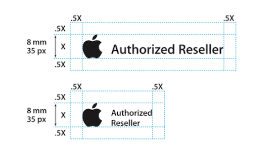
Image courtesy of Apple
General rules for the logo include specifications about the size, placement, how much negative space is around it, and the places your company considers appropriate usage.

Image courtesy of NASA
3. Color Palette
As we discussed in Brand Identity Design: the Building Blocks of Your Brand Identity, color is a powerful part of your brand identity.
To make sure your brand identity colors aren’t subjected to an over-zealous designer’s pastel or glow effect, your brand guide should have a detailed color palette.
The brand guide should clearly show what colors are permitted, where certain colors should (and shouldn’t) be used, and what colors should be avoided.
This should include specific color values (RGB, CMYK, and even Pantone) to remove uncertainty when creating collateral for the web, print, and other media.
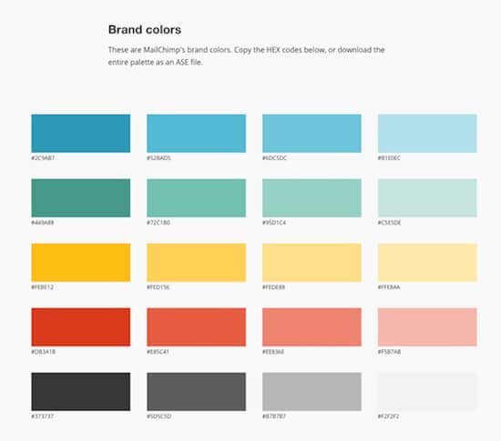
Image courtesy of MailChimp
4. Typography
Your typeface and font are important elements of your brand identity design, as are the rules you assign to them.
Headers, quotes, copy, and any fine print all need the right color choice, sizing, and style, with font choice of critical importance.
Stop that new intern from replacing your carefully chosen typeface with the dreaded Comic Sans MS by detailing all of your brand’s typography in your guide.

Image courtesy of Medium
5. Images
Your brand guide should include image guidelines: what’s allowed, what’s not, and when a specific image should be used.
You can even include instructions on where images should be sourced from, and if you have a particular aesthetic, what form it takes.
Some companies prefer images with people in them; others standardize on sweeping landscapes and vistas.
Whatever you’ve decided for your business should be spelled out in your guide so that your brand identity is consistent and strong.

Image courtesy of Spotify
6. Voice
Brand guides aren’t just for visual elements.
The lexicon your company chooses can help define your brand’s personality and can have a profound effect on how your customers interact with you.
While you don’t need a weighty tome, capturing the general sound of your company’s “voice” can make the difference between an anything-goes approach and something more measured and unique.

Image courtesy of Google
Ultimately, brand guides are not about crafting hard and fast rules for every little piece of your brand. They’re meant to be guidelines that create consistency and help your company project a unified presence.
Several tools are available to help you create your own brand guide, including Frontify and ZippyPixel’s printable brand guidelines template. There is also a seemingly endless inspiration available to help you learn from the work of others.
Chapter 7
How To Translate Your Brand Identity Into Actual Marketing
After you develop your brand identity, you’ll use it when you market your company’s products or services.
![]()
Remember that you won’t know if you’re doing things right unless you track key performance metrics and monitor your brand. Use Google Analytics and various survey and social media tools to get a sense of how people talk about your brand and interact with your brand. Doing so will help you tweak your brand identity and to correct mistakes.
To help you translate your brand identity into marketing (including digital marketing, social media marketing, and offline marketing), we want to share examples of companies that do a great job telling brand stories through their marketing.
Divine Chocolate: featuring brand promise
Your brand promise is the commitment your business makes to its customers.
Lee Fredericksen, the Managing Partner at Hinge Marketing, explains:
A brand promise is an extension of a company’s positioning. If you think of positioning as the fertile ground that allows a brand to germinate, grow and thrive, the brand promise is a brand’s fruit—it’s the tangible benefit that makes a product or service desirable.
Divine Chocolate promises its customers delicious chocolate. But that’s not all.

Image courtesy of Divine Chocolate
You may remember Divine Chocolate and its managing director Sophi Tranchell from 11 Entrepreneurs Who Are Changing the World.
Divine is a UK-based chocolatier.
Divine has made it their mission to “make the world a place where chocolate is cherished by everyone, including the family farmers who grow the cocoa.”
The Kuapa Kokoo cooperative farms Divine’s Chocolate in Ghana. The 85,000 farmers in the cooperative are co-owners of the company.
The farmers receive a share of the profits and have a voice in the business. Divine is following through on its promise in an authentic way.
Their brand promise – luxurious fair trade chocolate that you can feel good about enjoying – is an extension of this mission.
And, they’ve done an excellent job of prominently showcasing their brand promise within their larger brand story on their chocolate packaging.

Image courtesy of Divine Chocolate
The packaging for Divine’s chocolate bars prominently features their opulent gold script logo. This reminds customers of the high-quality and decadent chocolate experience awaiting inside.
The logo is printed in raised metallic ink, providing a tactile experience for the consumer and a visual one.
And surrounding that logo is a pattern of adrinka symbols. These symbols derive from Ghanaian culture and are still embraced by the Kuapa Kokoo cooperative farmers.
Each symbol represents a virtue that the brand values.
And that’s just the outside of the wrapper. The inside of Divine’s wrappers includes copy and graphics explaining their story.
Liz Miller, Divine’s Senior Marketing Manager, explains,
Consumers love discovering that the Fairtrade cocoa in our chocolate is grown by family farmers in Ghana and that they receive 44% of Divine profits… This empowers people to become a part of our story by treating themselves and others to Divine Chocolate.
Divine has masterfully communicated their brand story to its customers in an eye-pleasing and effective package, strengthening its brand identity and brand.
What you can learn from Divine Chocolate
- Feature your logo prominently to increase brand recognition and showcase your brand identity.
- Make thoughtful choices about the graphics that will best communicate your brand story. Dig deep and be selective – use the images that pack the most meaning possible while also jiving with the overall design concept and brand story.
Charlotte’s Web: brand perception

The Stanley Brothers (Charlotte’s Web) – Image courtesy of LA Weekly.
Charlotte’s Web, a manufacturer and retailer of high-quality CBD hemp oil, must walk a fine line.
Cannabis has a mixed reputation in the U.S., lots of competition, and many companies commonly use a similar brand identity.
But the Stanley brothers, founders of Charlotte’s Web, have worked hard to ensure that their product is “The World’s Most Trusted Hemp Extract.”
Their product is perceived as safe, legal, and of high quality. This is quite a feat considering the overwhelming stigma attached to the plant from which their product is made.
So, how do these legal sellers of medicinal hemp oils create such a positive brand perception?
They lean hard on their brand story of a dedicated family-run business and their heart-warming origins helping the real-life Charlotte become healthy enough to live like a normal kid.
And, their packaging design and package graphics help, too.

Image courtesy of Charlotte’s Web Hemp.
Charlotte’s Web products are packaged to inspire confidence. You can see that in their product images.
They use bold but trustworthy neutral colors that create the perception of sophistication – a far cry from the red, green, and yellow Rastafarian colors usually associated with cannabis.
There are no mushrooms, hookah-smoking caterpillars, or Grateful Dead bears here.
The minimalist design is elegant, professional, and understated with clean sans serif typography and simple line art.
But look closer – they’ve also modeled their design after traditional medicinal packaging.
They mention the number of milligrams of active ingredients contained in the product.
And, words like “balm,” “extract,” and “dietary supplement” create further associations with health and medicine.
In addition to that, the inclusion of Charlotte’s Web logo and brand name links back to the fuller brand story of how their product was able to help young Charlotte – after whom the company was named.
Finally, their branding is consistent throughout all of their products, strengthening their overall brand identity.
From their hemp oil extracts to their capsules and their balms, all packaging shares consistent visual branding.
This gives the whole line an air of professionalism and reliability.
What you can learn from Charlotte’s Web
- If your brand story is counter to popular perception, visually align your packaging design and package graphics to show the story you want to tell. Be careful to avoid references that might accidentally conjure the undesirable story you don’t want to associate with.
- Consistently brand your product packaging so that consumers can get to know and trust your visual brand. Repeat interactions with your visual brand will build familiarity and confidence.
- And, if you’re looking for cannabis packaging or CDB packaging, make sure you know how to optimize it for your target market.
PoopBags.com: brand personality

Image courtesy of Packaging of the World.
PoopBags.com is trying to solve a problem, help the planet, and have fun doing it.
Dogs will always poop.
And bags for cleaning up dog waste are in constant demand for city-dwelling dog owners.
But, no one is really excited about the topic of dog poop bags – except for Paul “Mr. Poop Bags” Canella.
Paul felt bad using non-biodegradable bags to collect his dog May’s waste, knowing that they were not good for our planet. So, he set out to create an Earth-friendlier biodegradable version to solve this issue.
But, even though a high-minded and worthwhile purpose drives canella, he’s never lost touch with his sense of humor:
Poop Bags! When you typed some keywords into your search engine of choice, you may have laughed when you saw the link for www.poopbags.com come up. Well, when I was walking my dog in the summer of 2003, I laughed too when I first thought about the idea…
PoopBags.com has a distinct personality that shines through in its product packaging.

Image courtesy of Packaging of the World.
PoopBags.com’s packaging design keeps things light and playful, showcasing their fun personality and maintaining the consistently fun and playful tone of its brand identity.
Their products come in boxes featuring a range of bright, exuberant colors juxtaposed with a neutral background.
The raw cardboard color shows through beneath the cheery, saturated pastels to remind consumers of their dedication to using and creating biodegradable materials.
Their logo embraces their brand’s light and humorous personality with a gently rounded font and a cute flower to remind consumers of their eco-mindedness and provide a cheeky nod to poop’s role as a fertilizer.
They complete their brand story with a seal claiming they have been “Saving the Earth Since 2003”. This seal features their dedication to helping the planet with their product.
PoopBags.com’s packaging unapologetically owns its role as purveyors of potty accessories and has fun with it.
But, they also manage to deftly remind their audience of their enthusiasm for protecting our planet, all in one cohesive and attractive design.
What you can learn from PoopBags.com
- Choose colors, imagery, and fonts that reflect your brand’s personality. And don’t forget to use an appropriate voice for your packaging copy. You can communicate so much about your brand by showing instead of telling.
- Share what your brand is all about. Do you have a cause or mission that you’re passionate about? What motivates you? Feature that in your packaging design.
A final note on using your brand identity in marketing. If you create multiple brands (which you might do if you have multiple products or services), keep them all separate and distinct, even if they’re part of the same family of products or services. There are two reasons to do this.
First, having a confusing brand identity for multiple products will tarnish your overall brand identity and will simply confuse customers and prospective customers.
Second, remember that most states require you to register your business if the trade name under which you operate your business differs from your business’s legal name.
For example, if your registered company is an LLC and is named Three Brothers, LLC, you cannot operate that business lawfully in most states if you’re selling products under the brand names Three Tigers, Three Panthers, etc. That’s because the registered name and your brand names are different.
Fortunately, this is not a difficult problem to overcome. You can simply register your actual brand names with your state (and or local government) by filing a “doing business as” (DBA) certificate. DBAs are also commonly called “assumed name,” “fictitious business name,” or “trade name.” Here’s a terrific resource that explains what a DBA is, the DBA state requirements, and how to file a DBA for your business in all 50 states and U.S. territories.
Chapter 8
Common Branding Mistakes
Over the past decade, we’ve observed many companies, even successful Fortune 100 companies, make critical branding mistakes.
Here are some most common branding mistakes – hopefully, you can avoid making them while you brand or rebrand your business.
![]()
Avoid a generic brand identity
How many business owners have thought: “I want my brand identity to be very bland and generic so that my company is indistinguishable from anyone else!”
Not one.
A strong brand identity is often the key difference between blending in and standing out from the competition.
But while most marketers and business owners often recognize the value of a strong brand identity, many don’t always prioritize it.
New business owners often incorrectly believe that a good logo will cost thousands or tens of thousands of dollars (that’s simply untrue – check out this guide to how much a logo design should cost).
As a result, they sometimes buy pre-made templates in an online logo store, try a do-it-yourself approach, or use so-called online logo makers (some of whom claim to use artificial intelligence, or AI, to create logos).
In fact, entrepreneurs aren’t the only ones who make the mistake of using generic logos- businesses of all sizes sometimes use logo shortcuts, only to find out that it’s even more expensive to rebrand later.
After all, memorable logos are 13% more likely to get consumers’ attention and 71.6% more likely to respond positively.
In a world of noise, that can make a big difference.
In certain industries, generic logos have become extremely problematic.
The epidemic of similar fonts, glyphs, and swishy people leaves a weak first impression on customers and is unmemorable.
We’ve talked about these generic logo symbols’ legal and branding dangers in The Logo Store Nightmare: Ready-Made Logos Harm Your Business.
To give you some perspective on why you should avoid generic branding, let’s look at four industries and the types of generic logos we often see in those industries.
Real estate generic logos

Many real estate industry logos show a house or some buildings with the company name underneath it.
It’s like putting the picture of a shoe on the logo of a shoe company!
The colors are usually in serious tones: reds, grays, and dull blues.
The logos are literal, but people already understand that a real estate company will deal with houses’ buying and selling. When people choose a real estate agency, they assume that!
They don’t know what makes a real estate company different, whether that is a personal touch or high-quality agents. Real estate companies that use generic elements in their logos completely miss the opportunity to stand out.
You’ve probably seen many variations of the logos above, with different brand names and some stylization.
If your logo has those elements, there are probably thousands of other businesses with similar logos. But you are also unlikely to recall any of those companies!
When you look at generic house logos, you don’t learn what the company is trying to communicate.
You can’t create a brand identity from forgettable elements.
A generic brand identity communicates nothing useful.
Finance generic logos
While each logo may look slightly different at first glance, most logos in the finance/consulting services industry look similar.
They focus heavily on the company name, often using a serif font to show seriousness and trust.
While there is some font size variation, the words are usually stacked and bolded to show emphasis.
The symbols don’t add much- they are mostly buildings and graphic lines.
Overall, many logos in this industry end up conveying exactly what people already think: boring, serious, money-focused companies.
While the seriousness and focus part of the message is usually intentional, a boring logo lends itself to customers not necessarily caring or knowing which company they prefer.
The companies all blend, and the first impression is weak. Few of those companies have developed a brand identity that stands out.
Smarter financial companies focus their logos around characters or rounder, friendlier fonts (an overall logo design trend).
Many financial companies are taking the opportunity to simplify their logos, including shorter versions of their names or relying more on a symbol to make their brands more memorable.
In an industry that screams complication and confusion, simple logos can go a long way.
Think differently. A unique brand identity can get you noticed quickly. This Brazilian credit card company proves that even financial companies can have simple, memorable logos:
![]()
![]()
Medical generic logos

Another industry that suffers from generic logos is the medical industry.
From insurance companies to hospitals to private practices and holistic treatment centers, medically-focused companies often reuse the same symbols, fonts, and colors.
Blues, reds, and greens are common colors in the medical industry.
They often mirror colors that are serious and focused on the human body.
But yet again, these colors and font choices seem extremely serious.
People already understand that a doctor’s office or insurance company will be focused and professional. When most people are trying to choose a medical provider, they look at the extra steps they take when they provide services, their customer service, kindness, and ability to be calm.
Much like the color and font schemes, the traditional symbols don’t help.
When every logo in the industry is a variation of one design, it makes it hard to remember which company is which and makes branding look like an afterthought.
A brand identity that’s indistinguishable from thousands of other companies will not help you build a successful business.
Technology generic logos
![]()
![]()
Even the most innovative industry struggles when it comes to logo design.
Many technology companies struggle to break out of the circular, swooshy glyph and name combination- much like many companies in the finance/consulting industry.
Not only are many tech companies’ symbols almost identical, but the colors tend to trend towards greens and blues in an attempt to look progressive, serious, and scientific.
But even more shocking is the lack of variety in font choices. Almost every font is dramatically spaced out. Many of the company names are in all caps, and the fonts are traditional with little creativity.
The stack of the symbols and fonts is formulaic, making the companies seem inaccessible and unimaginative.
Smart startups have become more creative when it comes to logo design. They are opting for friendlier, more creative logos as they try to communicate the innovation behind their company- not just their ability to leverage technology well.
By using different fonts and playing with different images, innovative technology companies can present themselves as interesting and engaging with consumers. We love Github’s logo as an example of playfulness and innovation:

2. Not delivering your brand identity consistently
If there’s one word that might encapsulate the habits of successful brands, it is consistency.
From Coca-Cola’s huge presence to smaller but equally memorable brands like Dollar Shave Club, behind any identity is a clear and consistent delivery.
The critical part is that this can’t just be online or in print: it needs to be evenly applied anywhere your company interacts with your customers.
It can be challenging to communicate your brand identity when you’re limited to a single large header image, but this is a perfect example of why good branding is more than just visual.
You have to adapt to each network’s constraints and find a way to represent your brand identity faithfully.
Companies like Coca-Cola understand that creating a compelling brand identity on social media means presenting themselves through visuals and voice.
3. Neglecting every branding opportunity
Most companies have the basics of good branding down: a distinct, audience-tested logo; a memorable tagline; a strong social media presence.
But there are still many places you can extend your brand identity.
When you give Powerpoint or Keynote presentations, how do the slides reflect your brand identity?
Many companies neglect to update their presentation templates or don’t create templates at all. You end up with a hodgepodge of slide designs and presentation designs that can seem inconsistent at best or unprofessional.
Take the time to create company-wide presentation templates and make sure they are used consistently and kept up to date as your brand identity evolves.
Another small but meaningful place that companies often neglect to extend their brand identity is their employee’s email signatures. We’re not suggesting you use massive, rich-media email signatures with embedded images and fancy typography (because those are annoying).
Including a short, concise message (such as your tagline), however, is a great way to use a space that would normally be forgotten.
And of course, use your company’s name as your email address if at all possible. An email address is part of your brand identity, too – don’t rely on a generic Gmail or Yahoo email address.

4. Cheating on your branding guidelines or brand guide
It’s one thing to make sure the brand you create is uniquely yours and cannot be misrepresented or misinterpreted by others.
It’s another thing to make sure your brand strategy is consistently applied internally as well.
Whether this happens intentionally (when an internal team takes matters into their own hands and deviates from the brand on purpose) or through carelessness or lax brand policing, the results are similar.
Many companies shoot themselves in the foot if employees do not follow established brand guidelines or brand guide.
Build brand guidelines or a brand guide to ensure that everyone responsible for putting your brand identity out to the public knows how to put your brand in the public sphere.
Keep guidelines as specific as possible, and keep them documented and accessible to all of your staff.
You worked hard to create your brand. Give your employees the tools they need so they don’t inadvertently go off-brand, and create internal checks so that you know your brand is applied correctly by all.
This is important in all your communications, even at events where you’ll publicly showcase your brand.
Ramon Ray, one of the country’s leading small business experts, explains:
How can you have brand consistency at an event? Start by hiring great people. If you need to create signs or marketing materials for the event, you certainly can go the DYI (do-it-yourself) route. But unless you’re a talented and experienced designer, you should focus on what you know best and hire the right people who can make your company and your brand look great.
5. Not evolving your brand identity
Just as consumer tastes and trends change over time, so should your brand and brand identity.
However, keep in mind that your brand is not just expressed visually, as we established earlier.
Some companies (like Target, Nike, or BMW) have kept their logo consistent for decades and keep their brands in step with the times.
For Target, this hasn’t been meant solely as a visual refresh (see below for how Target’s logo has changed over the years); it’s meant changes like updating the brands they carried, their stores’ layout, and the uniforms worn by staff.
Of course, we’re not talking about change for change’s sake.
A brand is a living document of not only what your company represents it also acts as a vital connection between your customers and your business. Listen to what your customers say on social media.
Don’t be afraid to involve them in the discussion. As your customers change, so should your brand identity.
6. If you rebrand, do it right
Rebranding can be a great way to refresh your brand by incorporating modern aesthetics into your existing company’s identity.
It’s important not to let your brand stagnate, and sometimes, a visual overhaul can help inspire consumer loyalty in existing and new markets.
However, if you introduce these changes poorly, you risk isolating your potential customer base and offending your existing one. When making changes to established brand identity, you need to be certain any changes made have benefits that significantly outweigh the risks of potentially losing business.
If you decide to make changes, clearly educate people about the changes you’re making. According to Matthew Kinsman, CEO at BaseCreate,
Customers who are already loyal to the brand deserve to be informed about the upcoming changes. It is essential to assure current customers that the new brand is a positive transformation and will not affect the service and commitment that the business has demonstrated thus far.
When introducing your rebrand, make sure that your blog, email blasts, and social media all act as helpful, informative communications for your customers.
Ensure you are conveying your rebranding efforts clearly so that your customers don’t end up confused or otherwise estranged from the brand they know.
Make sure your audience is informed to prevent your rebranding efforts from causing frustration.
Even major brands make mistakes when rebranding. In the following video, we look at four rebranding failures so that you can gracefully avoid these rebranding pitfalls.
Conclusion
A strong brand identity can mean the difference between your company succeeding beyond your wildest dreams or failing miserably.
![]()
The good news is that whether you succeed or fail is in your hands.
Are you ready to get started?
Interested in other types of businesses or how-to guides? Here are our comprehensive guides:
How to Start a Business: The Complete Step-by-Step Guide to Starting a Business in 2021
How to Write a Business Plan (2021)
Branding: The Definitive Guide for 2021
The Definitive Guide to Successfully Rebranding in 2021
How To Create a Unique and Memorable Brand Identity in 2021: The Definitive Guide
How to Start a Consulting Business in 2021: The Complete Step-by-Step Guide
How to Start a Real Estate Business in 2021: Complete Step-by-Step Guide
How to Start a Trucking Business in 2021: The Complete Guide
How to Start a Successful Online T-Shirt Business in 2021: The Definitive Guide
How to Start an eCommerce Business: A Step-by-Step Guide To Take Your Business Online (2021)
Nonprofit Branding: Complete Guide to Building a Strong Nonprofit Brand in 2021
How to Start a Cleaning Business in 2021: The Complete Guide
6 Businesses You Can Start For Less Than $1,000
Marketing Psychology: What You Must Know To Supercharge Your Marketing
What is a DBA and Hot to File One For Your Business
How to Start a Clothing Line or Clothing Brand From Scratch in 2021: The Definitive Guide
How to Start a Brewery Business in 2021: The Complete 9 Step Guide
How to Start a Medical Marijuana Dispensary Business in 2021
How to Start an Etsy Shop: Your Comprehensive, No-Stress Guide to Starting an Etsy Shop in 2021
How to Start a Photography Business in 2021: The Complete Step-by-Step Guide
How to Start a Business in Texas: The Complete Step-by-Step Guide (2021)
The Definitive Guide to Creating a Compelling Visual Brand for Your Restaurant in 2021
Conversion Rate Optimization (CRO) Guide: How to Make Your Website Work Smarter (2021)
Facebook Messenger Chatbot Marketing: The Definitive Guide (2021)
Branding for Food Trucks: The Definitive Guide (2021)
We regularly update this complete brand identity guide. We most recently updated this guide on March 18, 2021.

