

I start teaching a couple classes tomorrow; here are some cautionary notes.
From the first edition:
Forgetting whether nominal or real magnitudes are more important
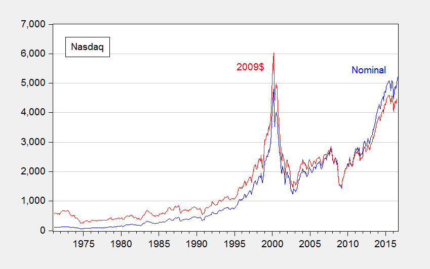
Often we hear of records being broken. But there are records and there are records. For instance, consider this headline: Nasdaq and S&P 500 Climb to Records. The statement is correct, but it’s lacking in context to the extent that the real, or inflation adjusted, price is more relevant (given that share prices represent valuations of a claim to capital).
Figure 1: Nasdaq (blue), and CPI-deflated (red), in 2009$. Source: NASDAQ via FRED, BLS, and author’s calculations.
Now, some people evidence wariness about deflation, particularly in terms of the accuracy of the deflators. However, it is usually better to account for price level effects and note the concerns, rather than rely on people to keep their preferred deflators in their head to calculate the real magnitudes (see this post).
Adding up chain weighted quantities
While in many cases, real magnitudes are the relevant ones, working with real magnitudes is not always straightforward. For instance, in principle, if one had data on real consumption by households in Wisconsin and household in Minnesota, and one wanted to add them up to find real consumption in Wisconsin and Minnesota, one could do that by deflating each state’s consumption by the CPI and adding. That’s true because the CPI is essentially a fixed base year weighted index (in this case, a Laspeyres index, using the initial weights).
This is not true for the series in the national income and product accounts, such as the components of GDP. The real measures – consumption, investment, government, net exports — are obtained using chain weighted deflators, i.e., deflators where the weights vary over time.
Can one make a mistake this way? Certainly. Consider this recent case at Political Calculations, wherein the commentator added up the state level real GDPs and because it didn’t match the national level GDP, the commentator inferred a massive impending downward revision in GDP.
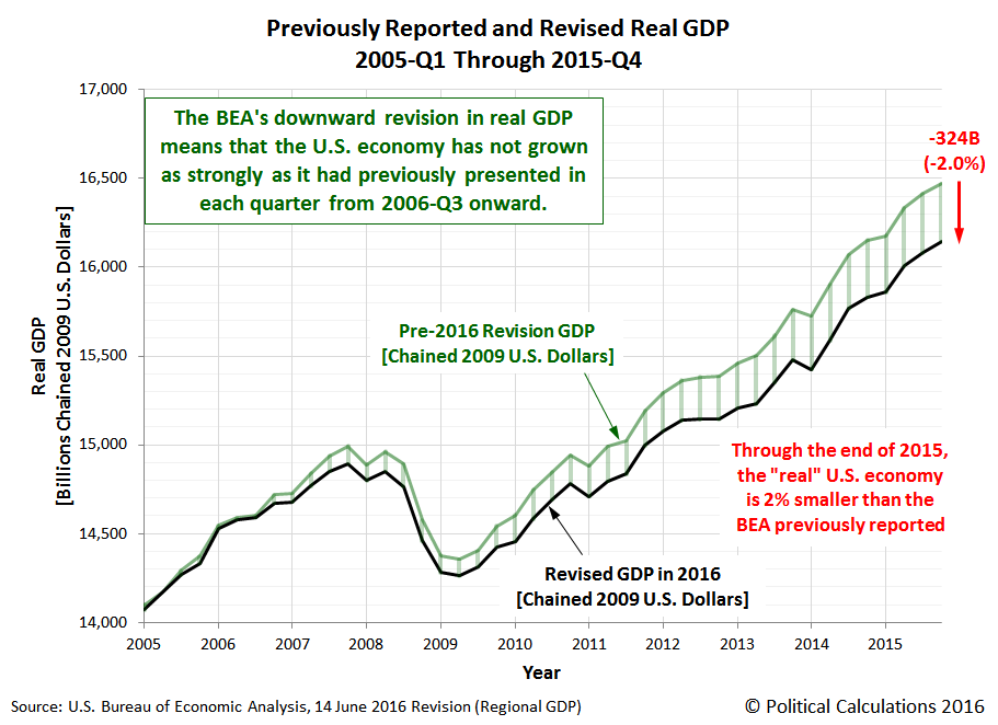
Source: Political Calculations.
Needless to say, the massive downward revision did not occur. Overall, real GDP was revised slightly upward. Figure 2 depicts what actually transpired.
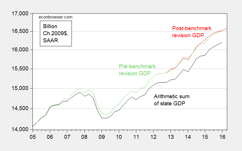
Figure 2: Real GDP pre-benchmark revision (green), post-benchmark revision (red), and arithmetic sum of state level GDP (black), all in Ch.2009$ SAAR. Source: BEA 2016Q1 3rd release, 2016Q2 advance release, BEA state level quarterly GDP, revision of 27 July 2016, and author’s calculations.
More discussion in this post. Now, sometimes one wants to express ratios of real magnitudes. This post discusses one way at getting at something like that.
Forgetting what “SAAR” means
SAAR is short for Seasonally Adjusted, at Annual Rates. Most US government statistics are reported using this convention, even when the data are at a monthly or quarterly frequency. (In contrast, European quarter-on-quarter GDP figures are often reported on a non-annualized basis.) Most prominently, quarterly GDP is reported at annual rates, so when one sees 18,000 Ch.09$ in 2016Q2, that doesn’t mean the flow of GDP was 18,000 Ch.09$ in that quarter; rather that if the flow that occurred in 2016Q2 continued for a whole year, then GDP would be recorded at 18,000 Ch.09$.
Now, this does not matter if one is calculating percentage growth rates (as long as one also remembers to annualize the growth rate if one is calculating quarter-on-quarter changes). It does matter if one is calculating a “multiplier”, the increase in GDP for a given increase in government spending. That’s because the government spending increase (or stimulus) is sometimes reported in absolute (non-annualized) rates, and GDP in SAAR terms. Obviously, if one did the mathematical calculation forgetting this point, one’s multipliers would look four times as large as they should. If compounded with failing to take into account annualizing growth rates, then they would look sixteen times as large as they should. Even professional economists make this mistake – consider the case of this University of Chicago economist, who thought “…the multiplier is 20 or 50 or something like that” because he was essentially dividing a quarterly stimulus figure by an annualized figure, and forgetting that growth rates are typically reported at annualized rates.
What about the “SA” part of the SAAR? Most of the time, one wants to use seasonally adjusted series; in fact, this is almost always what is reported in the newspapers. The reason is that there is a big seasonal component to many economic variables; retail sales jump in December because of the Christmas holidays, for instance.
Occasionally, people (usually noneconomists) get into trouble when they mix and match seasonal and non-seasonal data. For instance, Wisconsin Governor Walker’s campaign got into trouble when they touted job creation numbers obtained by adding together seasonally unadjusted jobs figures (from what is called the Quarterly Census of Employment and Wages) with seasonally adjusted jobs figures (from the establishment survey) to get a cumulative change in employment. (They did this because QCEW figures lag by many months, while the establishment survey data are more timely). This is shown in Figure 3.
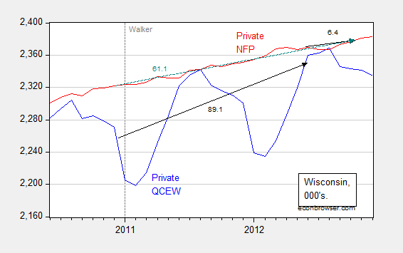
Figure 3: Wisconsin nonfarm private employment from Quarterly Census of Employment and Wages, not seasonally adjusted (blue), private nonfarm private employment from establishment survey, seasonally adjusted (red). Black arrows denote changes over QCEW and establishment survey figures; teal arrows over establishment survey. Source: BLS.
Notice that one can calculate the changes from December 2010 (just before Walker takes office) to March 2012 (the latest QCEW figures available as of December 12, 2012), and then add to the change from March 2012 to October 2012 (the latest establishment figure available as of December 12, 2012). That is, add 89.1 to 6.4 to get 95.5 thousand, close to the 100 thousand figure cited by Governor Walker’s campaign. You can see why Governor Walker’s campaign officials did so – the correct calculation using the change in the establishment survey from December 2010 to October 2012 was only 61.1 thousand.
Log aversion
Oftentimes, we depict economic statistics in log terms. The reason for this is that when plotted over time, a variable growing at a constant rate will look like it is accelerating if the Y-axis is expressed in level terms. However, it will look like a line with constant slope if the Y-axis is in log terms.
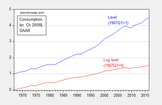
Figure 4: Real consumption, normalized to 1967Q1=1 (blue), and log real consumption, normalized to 1967Q1=0 (red). Source: BEA, 2016Q2 second release, and author’s calculations.
Solely examining the level series, consumption appears to be accelerating, particularly in the 2000’s. That illusory acceleration disappears in the log series.
For more on log transformations, see [1], [2], [3], [4], and [5]. And here’s Jim Hamilton’s post on logs. Here is an example of where the use of logs has driven someone to ranting and raving.
Shadowstats and other data conspiracies
It is not uncommon for commentators to allege conspiracies to manipulate government economic statistics. Take this FoxNews article:
What a coincidence. Just as momentum was building towards an interest rate hike by the Fed, along comes a dismal jobs report that takes any increase off the table. Contrary to the general perception, this is a lucky break for Democrats. … Given all that is stake, it is surprising that no one has questioned whether the jobs report might have been massaged by the Labor Department.
In modern times, these types of allegations are unfounded. The data series might not be particularly accurate, but deliberate manipulation to distort the economic picture does not occur for standard series released by the BEA, BLS, and Census.
One particularly egregious form of conspiracy-mongering is Shadowstats, a money-making enterprise that purports to provide a more accurate set of price measurement. Instead of going into detail, I will turn the case over to Jim Hamilton, who thoroughly debunks the Shadowstats approach. Anybody who cites Shadowstats should immediately lose all credibility. So … don’t do it!
More data conspiracies, see here.
From the second edition:
Don’t Reason from identities
One of the best known identities in economics is the definition of GDP:
Y ≡ C + I + G + X – IM
From this, a writer at the Heritage Foundation deduces the following:
Congress cannot create new purchasing power out of thin air. If it funds new spending with taxes, it is simply redistributing existing purchasing power (while decreasing incentives to produce income and output). If Congress instead borrows the money from domestic investors, those investors will have that much less to invest or to spend in the private economy. If they borrow the money from foreigners, the balance of payments will adjust by equally raising net imports, leaving total demand and output unchanged. Every dollar Congress spends must first come from somewhere else.
In other words, G rising by one dollar necessarily reduces either C or I by one dollar. Of course, this is true holding Y fixed. There is no reason why this should necessarily be true. One can’t say what happens without a model.
The author adds in another identity, the balance of payments, for good measure:
BP ≡ CA + FA + ORT
Where CA is the current account (approximately the trade balance, X-IM), FA the private financial account, and ORT official reserve transactions. FA going up by one dollar results necessarily in CA declining by one dollar in the author’s preferred interpretation. Of course, his holds ORT constant (no changes in foreign exchange reserves). And it rules out repercussion effects, such that offsetting lending occurs…
In other words, there is no way to avoid using some sort of model when one wants to impute cause and effect. It doesn’t have to be model with equations, but if one tries to avoid using a model, one ends up implicitly using a model, that more often than not, has internal inconsistencies, or implausible assumptions.
Don’t Forget to Check for Data Breaks
In this era of easily downloadable data, the analyst is tempted to skip to the calculations before reading the footnotes. This is problematic, because, as government and international statistical agencies collect data, the mode of the data collection or the means of calculation sometimes change. Those changes are usually noted, but if one does not read the documentation, one can make serious mistakes. For instance, examining civilian employment (FRED series CE16OV), one would think there was a tremendous boom in employment in January 2000.
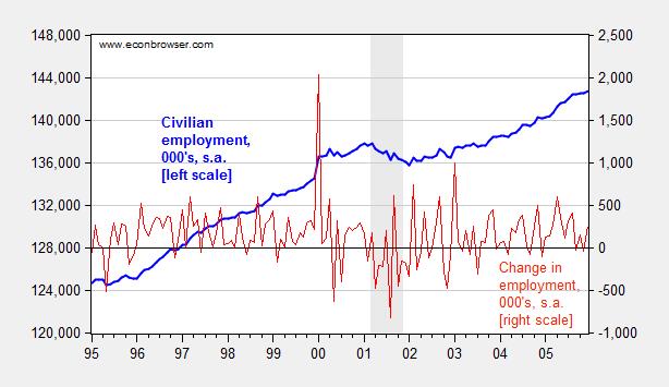
Figure 1: Civilian employment (blue, left scale) and change in civilian employment (red, right scale), both in 000’s, seasonally adjusted. Source: FRED series CE16OV.
If one inspects other series, say nonfarm payroll employment, one sees no corresponding jump. This suggests the boom interpretation is wrong. Further evidence of a “break” is found by inspecting the first difference of the series (in red). The spike in January 2000 is a 1.5% change (m/m), while the the standard deviation of changes is 0.3% (calculations in log terms).
In fact, the jump is due to the introduction of new population controls associated with the Census. New controls are applied every decade, so this is a recurring (and known — to those who are careful) problem. Nonetheless, here’s an example of the mistake regarding the participation figure. Other breaks are less obvious. This is a cautionary note to all who download data without consulting the documentation.
Don’t Make Absolute Predictions When Revisions Abound
Consider Professor Casey Mulligan on October 26, 2008:
According to the BLS, national nonfarm employment was 136,783,000 (SA) at the end of 2006, as the housing price crash was getting underway. Real GDP was $11.4 trillion (chained 2000 $). Barring a nuclear war or other violent national disaster, employment will not drop below 134,000,000 and real GDP will not drop below $11 trillion. The many economists who predict a severe recession clearly disagree with me, because 134 million is only 2.4% below September’s employment and only 2.0% below employment during the housing crash. Time will tell.
Time has told. Here is what actually happened.
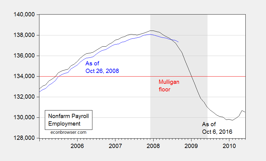
Figure 2: Nonfarm payroll employment, September 2008 release (blue), and September 2016 release (black), and 134,000,000 employment floor cited by Casey Mulligan (red). NBER defined recession dates shaded gray. Source: BLS via FRED and ALFRED.
Here is where knowing about revisions is important. Not only was finally revised employment 537,000 below what was estimated as of end-October; employment was falling much faster than estimated at the time. For the three months ending in August 2008, employment was falling 309,000/month, rather than 99,700/month.
Thinking about the data as settled numbers, rather than estimates, can lead to embarrassingly erroneous conclusions, to be long immortalized on the internet.
Don’t Do Simple Subtraction of Chain Weighted Measures
At Political Calculations, Ironman has focused on drought and manufacturing (particularly aircraft) as an explanation for Kansas’s lagging economic fortunes. Specifically, he asserts that real Kansas GDP stripped of agriculture and manufacturing looks much better. Unfortunately, his graph in his post plots a series where he calculated Kansas GDP ex-agriculture and manufacturing by simply subtracting real agriculture and real manufacturing — both measured in Chain weighted dollars — from real GDP measured in Chain weighted dollars (the red line in Figure 3 below). This is, quite plainly, the wrong procedure, as I explained in this post.
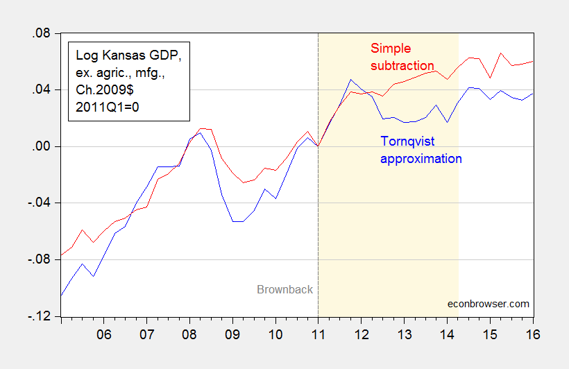
Figure 3: Log Kansas real GDP ex. agriculture and manufacturing, calculated using Törnqvist approximation (blue), and calculated using simple subtraction (red), 2011Q1=0. Dashed line at 2011Q1, Brownback takes office. Light tan shading denotes period during which Ironman identifies as drought. Source: BEA and author’s calculations.
Using durable manufacturing instead of total manufacturing does not change the results. In other words, Ironman’s conclusion is completely overturned when using the right calculation. So, beware making conclusions when you don’t understand the data!
Don’t Defend Factoids as Facts
In this era of the internet, it’s important to remember that the barriers to circulating misinformation are very low. Here is Governor Romney making a factual assertion, as quoted in Salon (see also WSJ):.
“We should be seeing numbers in the 500,000 jobs created per month. This is way, way, way off from what should happen in a normal recovery.
This is patently, wrong, as discussed in this post. But here is frequent commenter Rick Stryker trying to change the terms of debate:
Counting the number of times that monthly employment increases were greater than 500K since 1939 is just an attempt to lower the bar for what administration supporters know in their hearts is a failed presidency.
In 1939, the size of the labor force was 30 million; today it is 133 million. A 500K monthly increase on 30 milion [sic] would be truly gigantic and not at all what Romney was advocating. To put Romney’s remark in context, we need to adjust for the current size of the labor market, which we can simply do by dividing 500K into 133 million, yielding 0.38%. Going back to 1939, there are 172 cases in which monthly employment gains were at least 0.38% of the current labor market size. Admittedly, the last time we saw sustained increases of 0.38% of current labor market levels was during the recovery from the 1982 recession. But that just implies that Romney is setting an ambitious but not historically unreasonable employment goal. Given the size of the current employment hole, it is also necessary goal if we are to return to full employment anytime soon.
…
Note how Mr. Stryker tries to re-state Governor Romney’s assertion to make it seem more reasonable, in proportional terms. As I demonstrate in this post, the 500,000 number still remains clearly wrong, even after adjusting for labor force size. This is shown in the figure I generated at the time:

Figure 3: Log nonfarm payroll employment relative to 2009M06 trough (blue), to 2001M11 trough (red), to 1991M03 trough (green), 1982M10 trough (orange). Long dashed line at 2012M05 at the time of Governor Romney’s remarks. Source: BLS, May 2015 release, and author’s calculations.
Then the claim becomes aspirational, rather than factual. Quoting Mr. Stryker again:
…
Setting ambitious but reasonable goals is just what a future President should be doing. Supporters of the current administration understand that they need to lower expectations however. It was amusing to read erstwhile ecstatic now lukewarm Robert Deniro’s remarks to NBC’s David Gregory, which probably sums it up well for administration defenders: “..it’s not easy to be President of the United States.” And: “I know he’ll do better in the next four years…”
This process of changing the goalposts is the surest sign of someone knowing they have lost the argument, but refusing to admit error. Even Governor Romney subsequently changed his claim to 250,000 new jobs/month as being standard.
So kids, don’t be a “Rick Stryker”. Admit when you’ve made a mistake.
For other mistakes to avoid, see Rookie Economist Errors
Update, 10/13 4:45pm Pacific: The pseudonymous Rick Stryker keeps on digging. Below are two graphs — the first of month-on-month employment growth, and the 0.38% threshold that Stryker mentions as equivalent to Governor Romney’s 500,000/month employment growth, and the second as trailing 12 monthly average. The second highlights just how rare it is for the 500,000/mo figure to be realized over anything like a continuous time frame in recent decades, even when expressing in proportional terms as Rick Stryker suggests.

Figure 4: Month-on-month growth rate of nonfarm payroll employment (blue), and 0.38% threshold (red line). NBER defined recession dates shaded gray. Source: BLS, NBER, and author’s calculations.
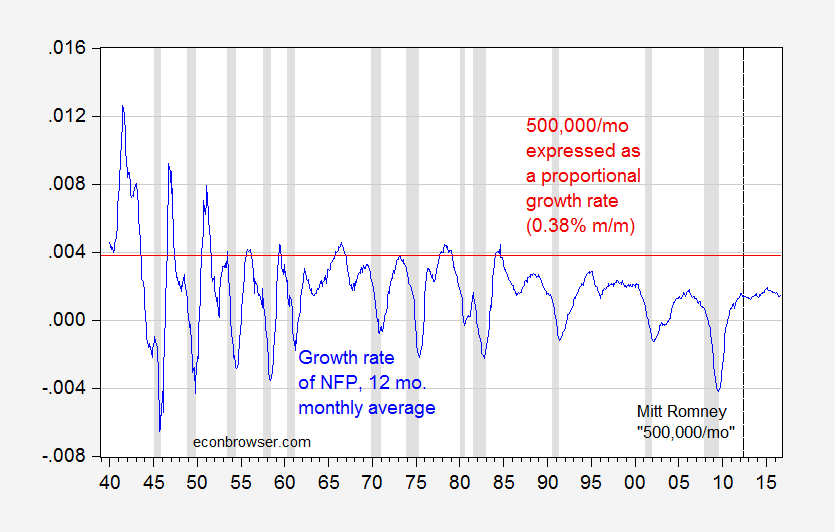
Figure 5: Trailing twelve month monthly average growth rate of nonfarm payroll employment (blue), and 0.38% threshold (red line). NBER defined recession dates shaded gray. Source: BLS, NBER, and author’s calculations.
Looks like one has to go way back to get the 500,000 norm to be reasonable…
Update, 10/17 4:15pm Pacific: In the interest of comprehensiveness, let me note an error I made, involving Rounding Errors (first noted in this post).
In principle, real quantity = total value/price deflator. For instance GDP09 = GDP/PGDP09, where GDP is measured in $, PGDP09 is the GDP deflator taking on a value of 1 in 2009, and GDP09 is GDP measured on 2009$. In practice, there is a slight rounding error, which typically does not make a difference, but can if (1) growth rates are very high (or very negative), and (2) one is annualizing quarterly growth rates.
I used the manually deflated series for the 2008Q4 q/q calculation, when in this case it would have been better to use the real series reported by BEA to do the calculation.
Figures 6 and 7 show the rounding errors.
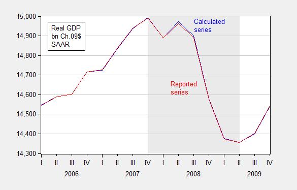
Figure 6: GDP in bn. Ch.2009$ SAAR, calculated by deflating nominal GDP with the GDP deflator (blue) and as reported by BEA (red), FRED series GDPC1. Source: BEA 2014Q2 2nd release and author’s calculations.
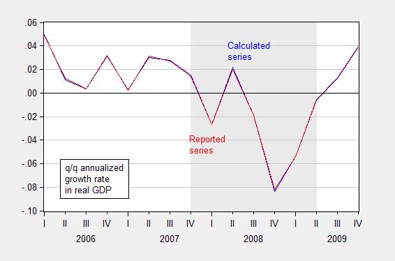
Figure 7: Quarter-on-quarter annualized growth rate in GDP in bn. Ch.2009$ SAAR, calculated by deflating nominal GDP with the GDP deflator (blue) and as reported by BEA (red), FRED series GDPC1. Source: BEA 2014Q2 2nd release and author’s calculations.
Yet more errors:
Don’t be casual about estimated trends.
Don’t make policy analysis based on not-statistically-significant parameters.
Do not attribute all things you don’t believe in to “conspiracy”, before checking the data yourself. (By the way, just because there’s no conspiracy doesn’t mean the data are unbiased or noisy).

